Lato 1.0
Documentation
created 02/25/2014
General Info
First of all THANK YOU for purchasing Lato. Before you get started, please be sure to always check out these documentation files. This document covers the installation, set up and use Lato - we encourage you to read this document thoroughly if you are experiencing any difficulties. Lato can only be used with WordPress and we assume that you already have WordPress installed and ready to go. If you do not, please see our section on WordPress to help you get started.
If you have any questions that are beyond the scope of this documentation, we encourage you to watch our Video Tutorials, and also join our Support Forum. If you are unable to find it anywhere, then please go to our support forum and open a new ticket with all details we need. Please be sure to include your site URL as well. Thank you, we hope you enjoy using Lato!
WordPress Information
To install this theme you must have a working version of WordPress already installed. For information in regard to installing Wordpress see the Wordpress Codex or you can watch the Instructional Video created by WooThemes.
- WordPress Codex - general info about WordPress and how to install on your server
- Instructional Video - awesome How-To video created by WooThemes
- First Steps With WordPress - general information that covers the wide variety of topics
- FAQ New To WordPress - the most popular FAQ's regarding WordPress
- WPBeginner's WordPress 101 video tutrials - some great videos from WPBeginner's on WordPress
What's included
Before you start playing around with this Theme, let's check what you've downloaded so far:
- Lato Theme Folder - contains the Lato.zip file
- Documentation Folder - contains this documentation and documentation for Revolution Slider.
- Demo Content Folder - contains the demo.xml and sample slider files
- Licencing Folder - contains licensing files
- Languages Folder - contains all files ready for translations.
Before You Post On Forum
To help speed along your request, please follow the steps below before posting a new ticket on the forum. This is for benefit of everyone and will help make the entire more efficient.
- Step 1 - Always check the Documentation. Most questions can be answered in this area.
- Step 2 - Always perform a Forum Search and Forum FAQ before you post, its very possible your issue has already been brought up and has been answered.
- Step 3 - If your question has not been brought up, then please open a new ticket. Always be as descriptive as possible. Enter the theme version, and the live URL to your home page or the page that shows the issue in question. You can also provide us with your login information to WordPress dashboard and FTP server in private ticket. All login info stays private with our support team.
- Step 4 - Patiently wait. We answer as quickly as possible.
Installation
You can install the theme in two ways through WordPress, or via FTP. It really dosen't matter which of the two ways you choose, just choose the one you feel more comfortable with. The Lato.zip file is the Installable WordPress Theme and what you need to use to get the theme installed. Please see the following section and watch our video tutorial on how to install Lato.
WordPress Installation
Follow the steps below to install via WordPress.
- Step 1 - Navigate to Appearance > Themes
- Step 2 - Click Add New Theme and hit Upload Theme button
- Step 3 - Now you just need to find the Lato.zip file in the Lato Theme folder and hit Install Now
- Step 4 - Wait while the theme is uploaded and installed.
- Step 5 - Activate the newly installed theme. Navigate to Appearance > Themes and acivate Lato theme.
- Step 6 - Then you will notice list of required (GravityShortcodes, WPBakery Visual Composer, Gravity Portfolio) and recomended plugins. You just need to click Begin installing plugin and follow the steps to install and activate these plugins.

FTP Installation
Follow the steps below to install via FTP.
- Step 1 - Login to your FTP account and navigate to your WordPress installation directory.
- Step 2 - Navigate to the folder /wp-content/themes
- Step 3 - Upload the "Lato" folder (not the .zip file) into your server. This is the folder located inside the Lato Theme folder.
- Step 4 - Activate the newly installed theme. Navigate to Appearance > Themes and acivate Lato theme.
- Step 5 - Then you will notice list of required (GravityShortcodes, WPBakery Visual Composer, Gravity Portfolio) and recomended plugins. You just need to click Begin installing plugin and follow the steps to install and activate these plugins.

How To Update The Theme
You can update your theme in two ways through WordPress, or via FTP but the first thing you need to do is download the new theme from Mojo Marketplace.
How To Update Your Theme via WordPress
- Step 1 - You need to deactivate the current Lato theme in Appearance > Themes section by simply activating a different theme.
- Step 2 - Once you activate different theme, you can delete the Lato theme. Don't worry, your content will not be lost. Click Theme Details on Lato theme and hit Delete button.
- Step 3 - Click Add New Theme and hit Upload Theme button
- Step 4 - Now you just need to find the Lato.zip file in the Lato Theme folder and hit Install Now
- Step 5 - Wait while the theme is uploaded and installed.
- Step 6 - Navigate to Appearance > Themes and acivate Lato theme.
How To Update Your Theme via FTP
- Step 1 - Login to your FTP account and navigate to /wp-content/themes location.
- Step 2 - Backup your "Lato" theme folder located on your server by saving it on your computer.
- Step 3 - After backup this folder, delete "Lato" folder on your server. Don't worry, your content will not be lost.
- Step 4 - Then simply drag and drop the new Lato folder (not the .zip file) into /wp-content/themes on your server.
- Step 5 - Activate the updated theme. Navigate to Appearance > Themes and acivate Lato theme.
Important Update Info
- Do Not Rename the Theme Folder - If you rename your theme folder when you update, then the path is no longer valid. WordPress stores menus and widget settings and some other settings by folder path. You need to rename your theme folder back to what it was before, and your settings, menus, widgets will be restored. If you need to keep your previous theme folder, then simply make a copy of it before you upload the new theme
- Reset Browser Cache - It is always recommended to reset your browser, plugin, server cache when you update. Visual issues may happen, its only cache that needs emptied. Each browser allows you to remove cookies, history and other data.
Demo Content
This Theme includes a demo.xml file which allows you to upload some content to your site to help you get started with the Lato and get to know the functionality. Please note, that the demo.xml file doesn't include images and includes only sample slider data. To import our demo content, please see the steps below.
- Step 1 - Install and activate these plugins before you proceed: Gravity Shortcodes, WPBakery Visual Composer, Gravity Portfolio, Gravity Widgets, Gravity Slider, WooSidebars, Revolution Slider, Contact Form 7, WooCommerce. WooCommerce is only needed if you want an online shop.
- Step 2 - Navigate to Tools > Import.
- Step 3 - Click on WordPress. If you haven't imported anything yet, you will need to install Importer plugin.
- Step 4 - Select the demo.xml file in the Demo Content folder.
- Step 5 - Now make sure to Select the Menu in Appearance > Menus (Read more) and set up Home as front page (Read more) and Blog as posts page under Seetings > Reading (Read more).

Header
The header is the first element you see on the page including logo and menu. The following sections will covers several sections that are listed below
- Header Theme Options
- Adding The Logo & Favicons
- Setting Up The Menu
- Using Mega Menu
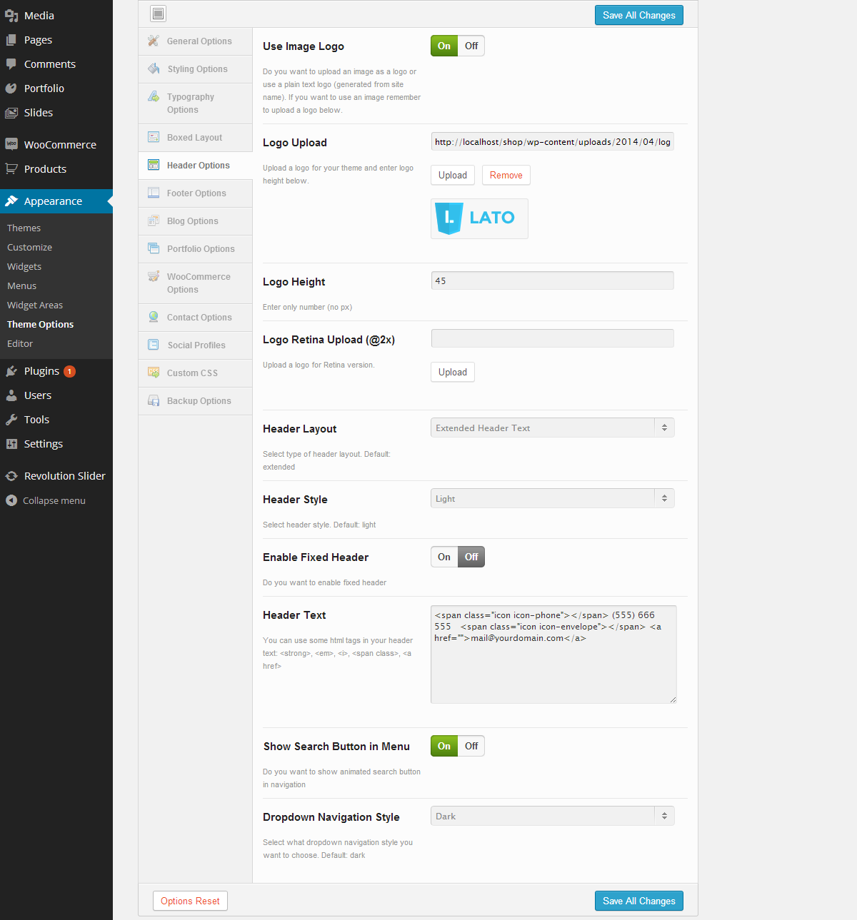
Header Theme Options
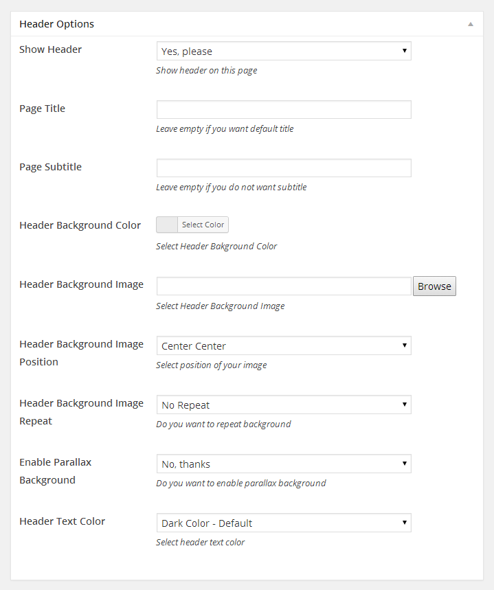
Lato includes Theme Options panel where you can customize your header in Header Options tab. Lato currently offers 5 Header Layouts and 2 styles: light and dark for Header and Dropdown Menu. You can also enable fixed header so it will be always visible and will stack on the top.
Follow These Steps To Setup The Header
- Step 1 - Navigate to Appearance > Theme Options > Header Options section
- Step 2 - Select one of the 5 Header Layout
- Step 3 - If you are using Extended Header Text or Extended Left Menu - Centered Logo you can change Header Text field
- Step 4 - If you are using Extended Social Icons you can add some social links to your profiles in Social Profiles tab. It will add some icons with links to your social profiles like Twitter, Facebook and more
- Step 5 - Manage your menu by drag and drop functionality. To create dropdown menu simply drag your menu item slightly to the bottom and right of another menu item
- Step 6 - You can turn your header into fixed header by checking Enable Fixed Header checkbox field
- Step 7 - You can show animated search button in your Primary Menu by checking Show Search Button in Menu checkbox field
- Step 8 - Once it's all done hit "Save All Changes" button
Here is a screenshot that shows the header options described above
Adding The Logo & Favicons
Lato comes with the option to upload your logo as an image file. The logo can be any size. You can also upload your logo 2x Retina version.
Follow These Steps To Insert The Logo
- Step 1 - Navigate to Appearance > Theme Options > Header Options section
- Step 2 - Check Use Image Logo checkbox field to add your logo
- Step 3 - Upload your standard logo to Logo Upload field
- Step 4 - Enter the standard logo height. It is required field (only numerical value - no px)
- Step 5 - Optional upload your Retina logo to Logo Retina Upload(@2x) field.
Adding the Favicons
Favicons are an icons associated with the url that are displayed in browser's address bar or next to the site name in a bookmark list. The Favicons Options are in the Appearance > Theme Options > General Options tab. You can see there fields to upload small 16x16px icons and bigger icons for different devices (like Apple Retina)
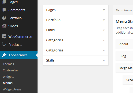
Setting Up The Menu
Lato comes with custom WordPress menu. There are 3 areas of the theme where you can assign a menu: Primary Menu, Secondary Menu and Footer Menu. Once the menu is created and assigned to the location it will show up on the side. Please see below for the menu locations and how to create a new menu.
3 Menu Locations
- Primary Menu - this is the main menu that shows in the header. This menu supports mega menu
- Secondary Menu - this is the menu that shows in the header top bar. It shows only first level of dropdown menu
- Footer Menu - this is the menu that shows in the footer. This menu does not support dropdown menu

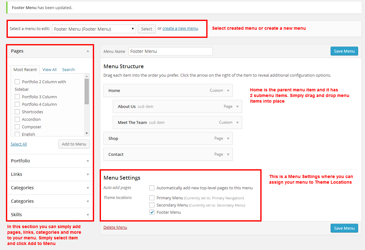
Follow These Steps To Create a New Menu
- Step 1 - Navigate to Appearance > Menus section
- Step 2 - Hit "create a new menu", enter the name and hit "Create Menu"
- Step 3 - To add a menu item select pages on the left side and click "Add to Menu"
- Step 4 - To add a custom menu item open Links box and add Link Text and URL
- Step 5 - Manage your menu by drag and drop functionality. To create dropdown menu simply drag your menu item slightly to the bottom and right of another menu item
- Step 6 - Add third level menu items to these columns
- Step 7 - After setting up your menu, scroll down to the bottom of the page to assign menu to one of 3 Theme locations
- Step 8 - Once it's all done hit "Save Menu" button
Here is a screenshot that shows the various menu settings described above
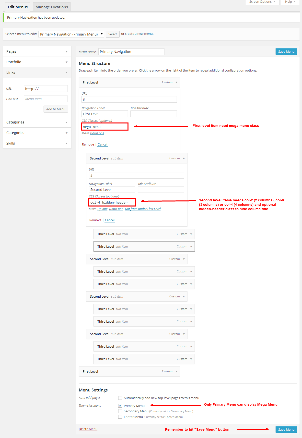
Using Mega Menu
Lato has build-in mega menu that can be enabled in primary menu. It can have 2-4 columns with column header enabled or disabled. Please see below information how to set this up.
Follow These Steps To Create Mega Menu
- Step 1 - Navigate to Appearance > Menus section and select to create a new menu, or edit current menu that you already have
- Step 2 - Make sure you have checked CSS Classes on Screen Options at the top of the page
- Step 3 - Click the "arrow icon" next to any parent (first level) menu item to expand the option box and add mega-menu class to the "CSS Classes" field
- Step 4 - Add 2, 3 or 4 child items to this parent mega-menu item and add respectively col-2, col-3 or col-4 classes to any "CSS Classes" field
- Step 5 - You can add hidden-header class separated by space to these second level items if you want to hide column title
- Step 6 - Add third level menu items to these columns
- Step 7 - Optionaly you can add icon to menu items. Add nav-icon and nav-{icon name here} separated by space. Here is the list of all icons name.
- Step 8 - After setting up your menu, scroll down to the bottom of the page to assign menu to the "Primary Menu" location in the Theme Locations box. Once it's all done hit "Save Menu" button
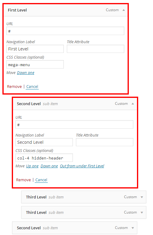
Here is a screenshot that shows the various mega menu settings described above
Pages
You can create as many pages as you want. Lato includes several page templates to choose from. You can select page template that suit your needs, e.g. select "Default Template" when you need full width page or "Page: Right Sidebar" when you want the sidebar on the right side.
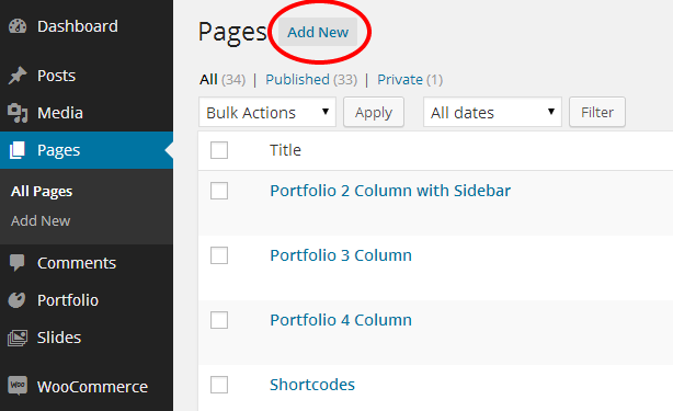
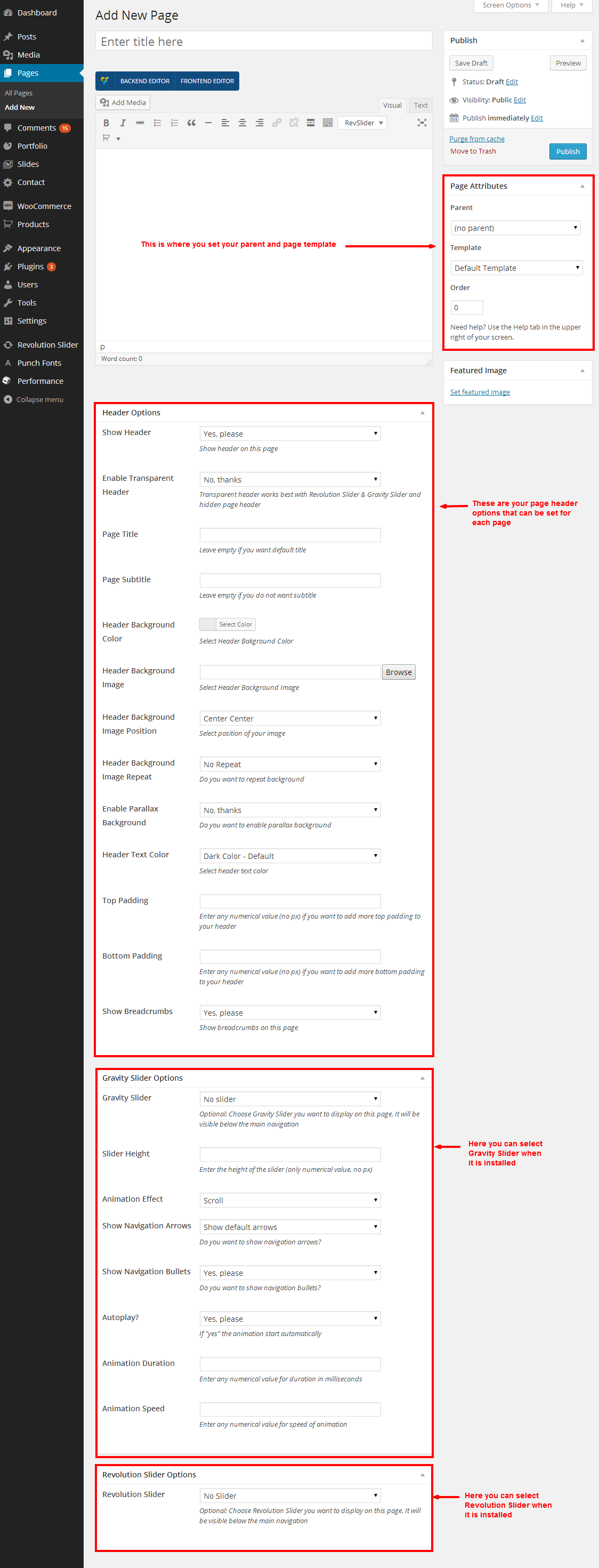
Follow These Steps To Create A New Page
- Step 1 - Navigate to Pages and click Add New
- Step 2 - Enter a new name for your page
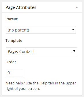
- Step 3 - Find the Page Attributes box on the right side and select Parent page (it's usually set to no parent)
- Step 4 - Select the page Template located in the same Page Attributes box. Take a look at the list of page templates below
- Step 5 - Select any number of page options located below, like Header Options, Gravity Slider Options, Revolution Slider Options, and Portfolio Options
- Step 6 - Add content to your page using the Visual or Text editor. The pages is built using the Shortcodes. Take a look at the Shortcode section for how to use them.
- Step 7 - Once it's all done hit "Publish" button
Here is the list of page templates with description of each one
- Default Template - this is the default full width template. You can add rows with full width background inside this template using visual composer page builder. See shortcode section
- Page: Blank - this is the blank page template that display without header and footer
- Page: Contact - this is the template that is recommended for your contact page. The full width Google map will automatically be displayed above any page content. See the instructions below how to set up this page
- Page: Left Sidebar - this is the template that has a sidebar on the left side. Choose this template for your blog
- Page: Right Sidebar - this is the template that has a sidebar on the right side. Choose this template for your blog
- Page: Sitemap - this is the template that is recommended for your sitemap. The list of all pages and last 20 posts will automatically display below any page content
- Portfolio: 2 Column with Sidebar - this is the template that display your portfolio items in 2 columns and sidebar on the right. Your optional content will display above the portfolio items
- Portfolio: 3 Column - this is the template that display your portfolio items in 3 columns without sidebar. Your optional content will display above the portfolio items
- Portfolio: 3 Column with Sidebar - this is the template that display your portfolio items in 3 columns and sidebar on the right. Your optional content will display above the portfolio items
- Portfolio: 4 Column - this is the template that display your portfolio items in 4 columns without sidebar. Your optional content will display above the portfolio items
- Portfolio: Full Width - this is the template that display your portfolio items in full width row without sidebar. Your optional content will display above the portfolio items
Here is a screenshot that shows the various page settings described above
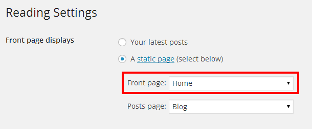
Setting Up Home Page
Setting up Home Page is the same as setting up any other pages except that you need to specify which page will be your main page. Lato comes with several pre-defined home page layouts. You can import pre-defined layout or build your own home page using shortcodes and Page Builder
Follow These Steps To Create Home Page
- Step 1 - Navigate to Settings > Reading
- Step 2 - Select a static page options
- Step 3 - Choose the page you want as your home page from the dropdown list
Setting Up Contact Page
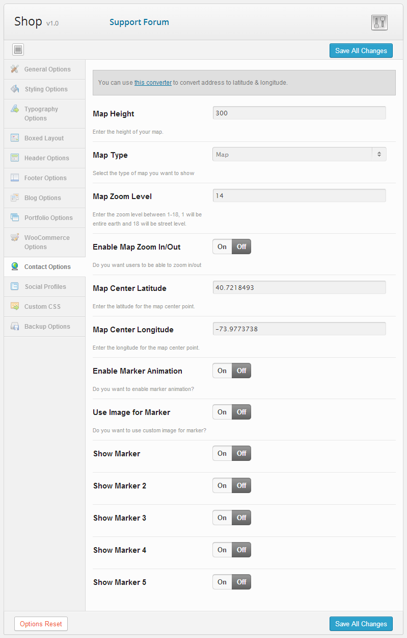
Lato comes with special page template for contact page - Page: Contact. When you select this template, google map will be display at the top of this page and the content will show up below it in full width layout. You can set locations for google map on Contact Options
Follow These Steps To Create Contact Page
- Step 1 - Navigate to Pages and click Add New
- Step 2 - Enter a new name for your page
- Step 3 - Find the Page Attributes box on the right side and select Page: Contact template
- Step 4 - Select any number of page options located below, like Header Options and optional Gravity Slider Options or Revolution Slider Options
- Step 5 - Add content to your page using the Visual editor using Page Builder or Text editor. The pages is built using the Shortcodes. Take a look at the Shortcode section for how to use them. This content will display below google map
- Step 6 - Once it's all done hit "Publish" button
- Step 7 - Navigate to Appearance > Theme Options > Contact Options
- Step 8 - Set any number of contact options, like map height, map type, locations, up to 5 markers
Here is a screenshot that shows the contact options described above
Page Header Options
You can set the custom header on every page you create. Enter the title and subtitle, choose background color or image and turn on the parallax effect on your header.
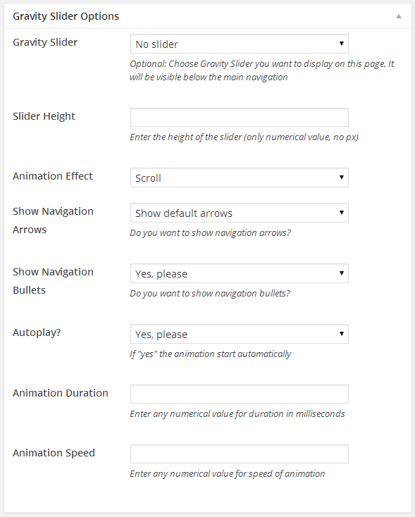
Gravity Slider Options
If you install Gravity Slider plugin you will see Gravity Slider Options. You can select the slider you want to display in header and configure different settings. Please see Sliders section below for more details.
Revolution Slider Options
If you install Revolution Slider plugin you will see Revolution Slider Options. You can select the slider you want to display in header

Shortcodes
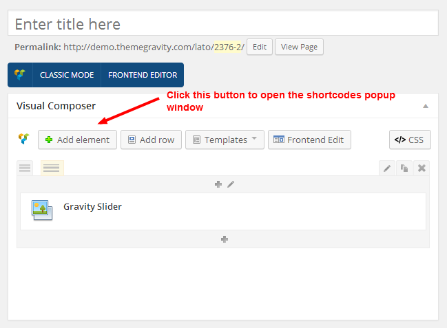
Lato includes many shortcodes that allow you to build unique layouts. You need to install Gravity Shortcodes plugin to enable shortcodes. All shortcodes are accessed in the Visual Editor and the easiest way to use them is the Backend Editor with drag and drop page builder.
Follow These Steps To Use The Shortcodes
- Step 1 - Open a page and click on the Visual editing tab
- Step 2 - Make sure you have Backend Editor enabled
- Step 3 - Click Add Element button
- Step 4 - In the popup window, select the shortcode you want, choose the shortcode options and click Save
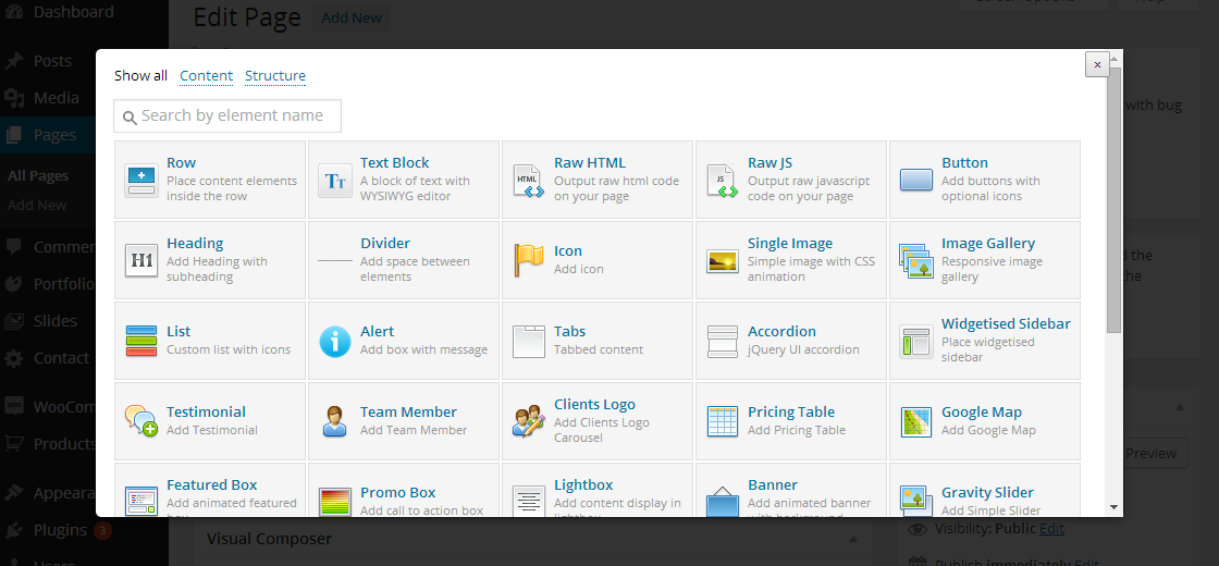
Each shortcode has its own unique options. Below you can find the list of shortcodes with options.
- Row
- Column
- Text Block
- Raw HTML
- Raw JS
- Button
- Heading
- Divider
- Icon
- Image With Animation
- Image Gallery
- List
- Alert
- Tab
- Accordion
- Widgetised Sidebar
- Testimonials
- Team Member
- Clients Logo
- Pricing Table
- Google Map
- Featured Box
- Promo Box
- Lightbox
- Banner
- Gravity Slider
- Revolution Slider
- Carousel
- Progress Bar
- Counter
- Pie Chart
- Audio
- Video
- Share Buttons
- Social Buttons
- Blog
- Recent Posts
- Portfolio
- Recent Projects
Row
[vc_row type="in-container" bg_image="" bg_position="left top" bg_repeat="no-repeat" parallax="" bg_color="" video_bg=""
                video_overlay="" video_overlay_color="" video_mp4="" video_webm="" video_ogv="" video_image="" text_color="dark"
custom_text_color="" text-align="left" padding_top="" padding_bottom="" shadow="no" id="" class=""]your columns here...[/vc_row]- type: one of these values: in-container, full-width-background or full-width-content
Use "In Container" if you want centered content without background
Use "Full Width Background" if you want centered content with background (color, image or video)
Use "Full Width Content" if you want your content across the entire width - bg_image: the ID of your image
- bg_position: one of these values: left top, left center, left bottom, center top, center center, center bottom, right top, right center, right bottom
- bg_repeat: one of these values: no-repeat or repeat
- parallax: one of these values: yes or no. It will enable or disable parallax effect
- bg_color: a hex value for your background, e.g. #f5f5f5
- video_bg: one of these values: yes or no. It will show or hide the video for background
- video_overlay: one of these values: yes or no. It will show or hide the semitransparent color on top of your video
- video_overlay_color: add hex color for your overlay, e.g. #000000
- video_mp4: URL to your mp4 video file. You must include this format & the webm format to render your video in all browser. OGV file is optional
- video_webm: URL to your webm video file
- video_ogv: URL to your ogv video file (optional)
- video_image: the ID of your poster image
- text_color: one of these values: dark, light or custom
- custom_text_color: a hex value for your text if you select custom text_color option above
- text_align: one of these values: left, center or right
- padding_top: only numerical value, e.g. 40 (no "px")
- padding_bottom: only numerical value, e.g. 40 (no "px")
- shadow: one of these values: no, inner or outer
- id: add a unique ID to style this element differently
- class: add a class or multiple classes to style this element differently
Column
[vc_column width="1/1" boxed="" text_align="" animation="no" delay="" speed="" id="" class=""]your content here...[/vc_column]- width: one of these values: 1/1, 1/2, 1/3, 1/4, 1/5, 2/3, 3/4
- boxed: one of these values: yes or no. If yes the background will be visible
- text_align: one of these values: none, left, center or right
- animation: one of these values: no, fade-from-left, fade-from-top, fade-from-bottom, fade-from-right, flip-vertical, flip-horizontal, grow-in
- delay: numerical value in milliseconds, e.g. 300
- speed: numerical value in milliseconds, e.g. 500
- id: add a unique ID to style this element differently
- class: add a class or multiple classes to style this element differently
Text BlockGo to Shortcodes List
[vc_column_text el_class=""]your content here...[/vc_column_text]- el_class: add a class or multiple classes to style this element differently
Raw HTMLGo to Shortcodes List
[vc_raw_html]your content here...[/vc_raw_html]Raw JSGo to Shortcodes List
[vc_raw_js]your content here...[/vc_raw_js]ButtonGo to Shortcodes List
[button text="Button Text" size="large" color="accent-color" link="#" link_title="" target="_self" icon="" icon_location="no"
id="" class=""]- text: the text you want to use in button
- size: one of these values: tiny, small, medium, large
- color: one of these values: primary-color, accent-color, extra-color1, extra-color2, extra-color3, extra-color4, light-color, see-through, see-through-dark
- link: the link you want the button to go to, including http://
- link_title: the text for title attributes (optional)
- target: one of these values: _blank for new window, _self for same window or popup for popup window
- icon: one of these set of icons
- icon_location: one of these values: no, before or after
- id: add a unique ID to style this element differently
- class: add a class or multiple classes to style this element differently
HeadingGo to Shortcodes List
[heading title="" subtitle="" level="h1" looks_like="" align="left" weight="" border="no" id="" class=""]- title: the text for your title
- subtitle: the text for your subtitle
- level: one of these values: h1, h2, h3, h4, h5 or h6
- looks_like: one of these values: h1, h2, h3, h4, h5 or h6. Change styling/size of heading element
- align: one of these values: left or center
- weight: one of these values: normal or light
- border: one of these values: yes, no. This will show or hide the title
- id: add a unique ID to style this element differently
- class: add a class or multiple classes to style this element differently
DividerGo to Shortcodes List
[divider style="solid" color="light" top_margin="" bottom_margin=""]- style: one of these values: solid, dashed, shadow or none
- color: one of these values: light or dark
- top_margin: numerical value to set top margin, no px
- bottom_margin: numerical value to set bottom margin, no px
IconGo to Shortcodes List
[icon type="font-icon" icon="icon-glass" size="tiny" color="text-color" image="" style="inline" animation="no" delay="" speed=""
id="" class=""]- type: one of these values: font-icon, image-icon
- icon: add a unique identifier of the icon you want to use, e.g. icon-glass (see list of icons below)
- size: one of these values: tiny, small, medium, large
- color: one of these values: text-color, primary-color, accent-color, extra-color1, extra-color2, extra-color3, extra-color4, black or white
- image: the ID of your image if you select image-icon above
- style: one of these values: inline, left or center
- animation: one of these values: no, fade-from-left, fade-from-top, fade-from-bottom, fade-from-right, flip-vertical, flip-horizontal, grow-in
- delay: numerical value in milliseconds, e.g. 300
- speed: numerical value in milliseconds, e.g. 500
- id: add a unique ID to style this element differently
- class: add a class or multiple classes to style this element differently
Here is the list of icons:
- icon-glass
- icon-music
- icon-search
- icon-envelope
- icon-heart
- icon-star
- icon-star-empty
- icon-user
- icon-film
- icon-th-large
- icon-th
- icon-th-list
- icon-ok
- icon-remove
- icon-zoom-in
- icon-zoom-out
- icon-off
- icon-signal
- icon-cog
- icon-trash
- icon-home
- icon-file
- icon-time
- icon-road
- icon-download-alt
- icon-download
- icon-upload
- icon-inbox
- icon-play-circle
- icon-repeat
- icon-refresh
- icon-list-alt
- icon-lock
- icon-flag
- icon-headphones
- icon-volume-off
- icon-volume-down
- icon-volume-up
- icon-qrcode
- icon-barcode
- icon-tag
- icon-tags
- icon-book
- icon-bookmark
- icon-print
- icon-camera
- icon-font
- icon-bold
- icon-italic
- icon-text-height
- icon-text-width
- icon-align-left
- icon-align-center
- icon-align-right
- icon-align-justify
- icon-list
- icon-indent-left
- icon-indent-right
- icon-facetime-video
- icon-picture
- icon-pencil
- icon-map-marker
- icon-adjust
- icon-tint
- icon-edit
- icon-share
- icon-check
- icon-move
- icon-step-backward
- icon-fast-backward
- icon-backward
- icon-play
- icon-pause
- icon-stop
- icon-forward
- icon-fast-forward
- icon-step-forward
- icon-eject
- icon-chevron-left
- icon-chevron-right
- icon-plus-sign
- icon-minus-sign
- icon-remove-sign
- icon-ok-sign
- icon-question-sign
- icon-info-sign
- icon-screenshot
- icon-remove-circle
- icon-ok-circle
- icon-ban-circle
- icon-arrow-left
- icon-arrow-right
- icon-arrow-up
- icon-arrow-down
- icon-share-alt
- icon-resize-full
- icon-resize-small
- icon-plus
- icon-minus
- icon-asterisk
- icon-exclamation-sign
- icon-gift
- icon-leaf
- icon-fire
- icon-eye-open
- icon-eye-close
- icon-warning-sign
- icon-plane
- icon-calendar
- icon-random
- icon-comment
- icon-magnet
- icon-chevron-up
- icon-chevron-down
- icon-retweet
- icon-shopping-cart
- icon-folder-close
- icon-folder-open
- icon-resize-vertical
- icon-resize-horizontal
- icon-bar-chart
- icon-twitter-sign
- icon-facebook-sign
- icon-camera-retro
- icon-key
- icon-cogs
- icon-comments
- icon-thumbs-up
- icon-thumbs-down
- icon-star-half
- icon-heart-empty
- icon-signout
- icon-linkedin-sign
- icon-pushpin
- icon-external-link
- icon-signin
- icon-trophy
- icon-github-alt
- icon-upload-alt
- icon-lemon
- icon-phone
- icon-check-empty
- icon-bookmark-empty
- icon-phone-sign
- icon-twitter
- icon-facebook
- icon-github
- icon-unlock
- icon-credit
- icon-rss
- icon-hdd
- icon-bullhorn
- icon-bell
- icon-certificate
- icon-hand-right
- icon-hand-left
- icon-hand-up
- icon-hand-down
- icon-circle-arrow-left
- icon-circle-arrow-right
- icon-circle-arrow-up
- icon-circle-arrow-down
- icon-globe
- icon-wrench
- icon-tasks
- icon-filter
- icon-briefcase
- icon-fullscreen
- icon-group
- icon-link
- icon-cloud
- icon-beaker
- icon-cut
- icon-copy
- icon-paper-clip
- icon-save
- icon-sign-blank
- icon-reorder
- icon-list-ul
- icon-list-ol
- icon-strikethrough
- icon-underline
- icon-table
- icon-magic
- icon-truck
- icon-pinterest
- icon-pinterest-sign
- icon-google-plus-sign
- icon-google-plus
- icon-money
- icon-caret-down
- icon-caret-up
- icon-caret-left
- icon-caret-right
- icon-columns
- icon-sort
- icon-sort-down
- icon-sort-up
- icon-envelope-alt
- icon-linkedin
- icon-undo
- icon-legal
- icon-dashboard
- icon-comment-alt
- icon-comments-alt
- icon-bolt
- icon-sitemap
- icon-umbrella
- icon-paste
- icon-lightbulb
- icon-exchange
- icon-cloud-download
- icon-cloud-upload
- icon-user-md
- icon-stethoscope
- icon-suitcase
- icon-bell-alt
- icon-coffee
- icon-food
- icon-file-alt
- icon-building
- icon-hospital
- icon-ambulance
- icon-medkit
- icon-fighter-jet
- icon-beer
- icon-h-sign
- icon-plus-sign2
- icon-double-angle-left
- icon-double-angle-right
- icon-double-angle-up
- icon-double-angle-down
- icon-angle-left
- icon-angle-right
- icon-angle-up
- icon-angle-down
- icon-desktop
- icon-laptop
- icon-tablet
- icon-mobile
- icon-circle-blank
- icon-quote-left
- icon-quote-right
- icon-spinner
- icon-circle
- icon-reply
- icon-github-alt
- icon-folder-close-alt
- icon-folder-open-alt
- icon-expand-alt
- icon-collapse-alt
- icon-smile
- icon-frown
- icon-meh
- icon-gamepad
- icon-keyboard
- icon-flag-alt
- icon-flag-checkered
- icon-terminal
- icon-code
- icon-reply-all
- icon-star-half-full
- icon-location-arrow
- icon-crop
- icon-code-fork
- icon-unlink
- icon-question
- icon-info
- icon-exclamation
- icon-superscript
- icon-subscript
- icon-eraser
- icon-puzzle
- icon-microphone
- icon-microphone-off
- icon-shield
- icon-calendar-empty
- icon-fire-extinguisher
- icon-rocket
- icon-maxcdn
- icon-chevron-sign-left
- icon-chevron-sign-right
- icon-chevron-sign-up
- icon-chevron-sign-down
- icon-html5
- icon-css3
- icon-anchor
- icon-unlock-alt
- icon-bullseye
- icon-ellipsis-horizontal
- icon-ellipsis-vertical
- icon-rss-sign
- icon-play-sign
- icon-ticket
- icon-minus-sign-alt
- icon-check-minus
- icon-level-up
- icon-level-down
- icon-check-sign
- icon-edit-sign
- icon-external-link-sign
- icon-share-sign
- icon-compass
- icon-collapse
- icon-collapse-top
- icon-expand
- icon-euro
- icon-gbp
- icon-dollar
- icon-rupee
- icon-yen
- icon-renminbi
- icon-won
- icon-bitcoin
- icon-file2
- icon-file-text
- icon-sort-by-alphabet
- icon-sort-by-alphabet-alt
- icon-sort-by-attributes
- icon-sort-by-attributes-alt
- icon-sort-by-order
- icon-sort-by-order-alt
- icon-thumbs-up2
- icon-thumbs-down2
- icon-youtube-sign
- icon-youtube
- icon-xing
- icon-xing-sign
- icon-youtube-play
- icon-dropbox
- icon-stackexchange
- icon-instagram
- icon-flickr
- icon-adn
- icon-bitbucket
- icon-bitbucket-sign
- icon-tumblr
- icon-tumblr-sign
- icon-long-arrow-down
- icon-long-arrow-up
- icon-long-arrow-left
- icon-long-arrow-right
- icon-apple
- icon-windows
- icon-android
- icon-linux
- icon-dribbble
- icon-skype
- icon-foursquare
- icon-trello
- icon-female
- icon-male
- icon-gittip
- icon-sun
- icon-moon
- icon-archive
- icon-bug
- icon-vk
- icon-weibo
- icon-renren
- linecons-heart
- linecons-cloud
- linecons-star
- linecons-tv
- linecons-sound
- linecons-video
- linecons-trash
- linecons-user
- linecons-key
- linecons-search
- linecons-settings
- linecons-camera
- linecons-tag
- linecons-lock
- linecons-bulb
- linecons-pen
- linecons-diamond
- linecons-display
- linecons-location
- linecons-eye
- linecons-bubble
- linecons-stack
- linecons-cup
- linecons-phone
- linecons-news
- linecons-mail
- linecons-like
- linecons-photo
- linecons-note
- linecons-clock
- linecons-paperplane
- linecons-params
- linecons-banknote
- linecons-data
- linecons-music
- linecons-megaphone
- linecons-study
- linecons-lab
- linecons-food
- linecons-t-shirt
- linecons-fire
- linecons-clip
- linecons-shop
- linecons-calendar
- linecons-wallet
- linecons-vynil
- linecons-truck
- linecons-world
- steady-type
- steady-box
- steady-archive
- steady-envelope
- steady-email
- steady-files
- steady-uniE79E
- steady-settings
- steady-add
- steady-file
- steady-align-left
- steady-align-right
- steady-align-center
- steady-align-justify
- steady-file-broken
- steady-browser
- steady-windows
- steady-window
- steady-folder
- steady-folder-add
- steady-folder-settings
- steady-folder-check
- steady-wifi-low
- steady-wifi-mid
- steady-wifi-full
- steady-connection-empty
- steady-connection-25
- steady-connection-50
- steady-connection-75
- steady-connection-full
- steady-list
- steady-grid
- steady-uniE7B8
- steady-battery-charging
- steady-battery-empty
- steady-battery-25
- steady-battery-50
- steady-battery-75
- steady-battery-full
- steady-settings
- steady-arrow-left
- steady-up
- steady-down
- steady-right
- steady-reload
- steady-refresh
- steady-volume
- steady-volume-increase
- steady-volume-decrease
- steady-mute
- steady-microphone
- steady-microphone-off
- steady-book
- steady-checkmark
- steady-checkbox-checked
- steady-checkbox
- steady-paperclip
- steady-download
- steady-tag
- steady-trashcan
- steady-search
- steady-zoom-in
- steady-zoom-out
- steady-chat
- steady-chat-1
- steady-chat-2
- steady-chat-3
- steady-comment
- steady-calendar
- steady-bookmark
- steady-email2
- steady-heart
- steady-enter
- steady-cloud
- steady-book2
- steady-star
- steady-clock
- steady-printer
- steady-home
- steady-flag
- steady-meter
- steady-switch
- steady-forbidden
- steady-lock
- steady-unlocked
- steady-unlocked2
- steady-users
- steady-user
- steady-users2
- steady-user2
- steady-bullhorn
- steady-share
- steady-screen
- steady-phone
- steady-portrait
- steady-landscape
- steady-tablet
- steady-tablet-landscape
- steady-laptop
- steady-camera
- steady-microwave-oven
- steady-credit-cards
- steady-calculator
- steady-bag
- steady-diamond
- steady-drink
- steady-shorts
- steady-vcard
- steady-sun
- steady-bill
- steady-coffee
- steady-uniE807
- steady-newspaper
- steady-stack
- steady-map-marker
- steady-map
- steady-support
- steady-uniE80D
- steady-barbell
- steady-stopwatch
- steady-atom
- steady-syringe
- steady-health
- steady-bolt
- steady-pill
- steady-bones
- steady-lab
- steady-clipboard
- steady-mug
- steady-bucket
- steady-select
- steady-graph
- steady-crop
- steady-image
- steady-cube
- steady-bars
- steady-chart
- steady-pencil
- steady-measure
- steady-eyedropper
- icomoon-home
- icomoon-home2
- icomoon-home3
- icomoon-office
- icomoon-newspaper
- icomoon-pencil
- icomoon-pencil2
- icomoon-quill
- icomoon-pen
- icomoon-blog
- icomoon-droplet
- icomoon-format
- icomoon-image
- icomoon-image2
- icomoon-images
- icomoon-camera
- icomoon-music
- icomoon-headphones
- icomoon-play
- icomoon-film
- icomoon-camera2
- icomoon-dice
- icomoon-pacman
- icomoon-spades
- icomoon-clubs
- icomoon-diamonds
- icomoon-pawn
- icomoon-bullhorn
- icomoon-connection
- icomoon-podcast
- icomoon-feed
- icomoon-book
- icomoon-books
- icomoon-library
- icomoon-file
- icomoon-profile
- icomoon-file2
- icomoon-file3
- icomoon-file4
- icomoon-copy
- icomoon-copy2
- icomoon-copy3
- icomoon-paste
- icomoon-paste2
- icomoon-paste3
- icomoon-stack
- icomoon-folder
- icomoon-folder-open
- icomoon-tag
- icomoon-tags
- icomoon-barcode
- icomoon-qrcode
- icomoon-ticket
- icomoon-cart
- icomoon-cart2
- icomoon-cart3
- icomoon-coin
- icomoon-credit
- icomoon-calculate
- icomoon-support
- icomoon-phone
- icomoon-phone-hang-up
- icomoon-address-book
- icomoon-notebook
- icomoon-envelope
- icomoon-pushpin
- icomoon-location
- icomoon-location2
- icomoon-compass
- icomoon-map
- icomoon-map2
- icomoon-history
- icomoon-clock
- icomoon-clock2
- icomoon-alarm
- icomoon-alarm2
- icomoon-bell
- icomoon-stopwatch
- icomoon-calendar
- icomoon-calendar2
- icomoon-print
- icomoon-keyboard
- icomoon-screen
- icomoon-laptop
- icomoon-mobile
- icomoon-mobile2
- icomoon-tablet
- icomoon-tv
- icomoon-cabinet
- icomoon-drawer
- icomoon-drawer2
- icomoon-drawer3
- icomoon-box-add
- icomoon-box-remove
- icomoon-download
- icomoon-upload
- icomoon-disk
- icomoon-storage
- icomoon-undo
- icomoon-redo
- icomoon-flip
- icomoon-flip2
- icomoon-undo2
- icomoon-redo2
- icomoon-forward
- icomoon-reply
- icomoon-bubble
- icomoon-bubbles
- icomoon-bubbles2
- icomoon-bubble2
- icomoon-bubbles3
- icomoon-bubbles4
- icomoon-user
- icomoon-users
- icomoon-user2
- icomoon-users2
- icomoon-user3
- icomoon-user4
- icomoon-quotes-left
- icomoon-busy
- icomoon-spinner
- icomoon-spinner2
- icomoon-spinner3
- icomoon-spinner4
- icomoon-spinner5
- icomoon-spinner6
- icomoon-binoculars
- icomoon-search
- icomoon-zoom-in
- icomoon-zoom-out
- icomoon-expand
- icomoon-contract
- icomoon-expand2
- icomoon-contract2
- icomoon-key
- icomoon-key2
- icomoon-lock
- icomoon-lock2
- icomoon-unlocked
- icomoon-wrench
- icomoon-settings
- icomoon-equalizer
- icomoon-cog
- icomoon-cogs
- icomoon-cog2
- icomoon-hammer
- icomoon-wand
- icomoon-aid
- icomoon-bug
- icomoon-pie
- icomoon-stats
- icomoon-bars
- icomoon-bars2
- icomoon-gift
- icomoon-trophy
- icomoon-glass
- icomoon-mug
- icomoon-food
- icomoon-leaf
- icomoon-rocket
- icomoon-meter
- icomoon-meter2
- icomoon-dasboard
- icomoon-hammer2
- icomoon-fire
- icomoon-lab
- icomoon-magnet
- icomoon-remove
- icomoon-remove2
- icomoon-briefcase
- icomoon-airplane
- icomoon-truck
- icomoon-road
- icomoon-accessibility
- icomoon-target
- icomoon-shield
- icomoon-lightning
- icomoon-switch
- icomoon-power-cord
- icomoon-signup
- icomoon-list
- icomoon-list2
- icomoon-numbered-list
- icomoon-menu
- icomoon-menu2
- icomoon-tree
- icomoon-cloud
- icomoon-cloud-download
- icomoon-upload
- icomoon-download2
- icomoon-upload2
- icomoon-download3
- icomoon-upload3
- icomoon-globe
- icomoon-earth
- icomoon-link
- icomoon-flag
- icomoon-attachment
- icomoon-eye
- icomoon-eye-blocked
- icomoon-eye2
- icomoon-bookmark
- icomoon-bookmarks
- icomoon-bright-medium
- icomoon-bright-contrast
- icomoon-contrast
- icomoon-star
- icomoon-star2
- icomoon-star3
- icomoon-heart
- icomoon-heart2
- icomoon-heart-broken
- icomoon-thumbs-up
- icomoon-thumbs-up2
- icomoon-happy
- icomoon-happy2
- icomoon-smiley
- icomoon-smiley2
- icomoon-tongue
- icomoon-tongue2
- icomoon-sad
- icomoon-sad2
- icomoon-wink
- icomoon-wink2
- icomoon-grin
- icomoon-grin2
- icomoon-cool
- icomoon-cool2
- icomoon-angry
- icomoon-angry2
- icomoon-evil
- icomoon-evil2
- icomoon-shocked
- icomoon-shocked2
- icomoon-confused
- icomoon-confused2
- icomoon-neutral
- icomoon-neutral2
- icomoon-wondering
- icomoon-wondering2
- icomoon-point-up
- icomoon-point-right
- icomoon-point-down
- icomoon-point-left
- icomoon-warning
- icomoon-notification
- icomoon-question
- icomoon-info
- icomoon-info2
- icomoon-blocked
- icomoon-cancel-circle
- icomoon-checkmark-circle
- icomoon-spam
- icomoon-close
- icomoon-checkmark
- icomoon-checkmark2
- icomoon-spell-check
- icomoon-minus
- icomoon-plus
- icomoon-enter
- icomoon-exit
- icomoon-play2
- icomoon-pause
- icomoon-stop
- icomoon-backward
- icomoon-forward2
- icomoon-play3
- icomoon-pause2
- icomoon-stop2
- icomoon-backward2
- icomoon-forward3
- icomoon-firs2
- icomoon-last
- icomoon-previous
- icomoon-next
- icomoon-eject
- icomoon-volume-high
- icomoon-volume-medium
- icomoon-volume-low
- icomoon-volume-mute
- icomoon-volume-mute2
- icomoon-volume-increase
- icomoon-volume-decrease
- icomoon-loop
- icomoon-loop2
- icomoon-loop3
- icomoon-shuffle
- icomoon-arrow-up-left
- icomoon-arrow-up
- icomoon-arrow-up-right
- icomoon-arrow-right
- icomoon-arrow-down-right
- icomoon-arrow-down
- icomoon-arrow-down-left
- icomoon-arrow-left
- icomoon-arrow-up-left2
- icomoon-arrow-up2
- icomoon-arrow-up-right2
- icomoon-arrow-right2
- icomoon-arrow-down2
- icomoon-arrow-down-left2
- icomoon-arrow-left2
- icomoon-arrow-up-left3
- icomoon-arrow-up3
- icomoon-arrow-up-right3
- icomoon-arrow-right3
- icomoon-arrow-down3
- icomoon-arrow-down-left3
- icomoon-arrow-left3
- icomoon-tab
- icomoon-checkbox-checked
- icomoon-checkbox-partial
- icomoon-radio-checked
- icomoon-radio-unchecked
- icomoon-crop
- icomoon-scissors
- icomoon-filter
- icomoon-filter2
- icomoon-font
- icomoon-text-height
- icomoon-text-width
- icomoon-bold
- icomoon-underline
- icomoon-italic
- icomoon-strikethrough
- icomoon-omega
- icomoon-sigma
- icomoon-table
- icomoon-table2
- icomoon-insert-template
- icomoon-pilcrow
- icomoon-left-toright
- icomoon-right-toleft
- icomoon-paragraph-left
- icomoon-paragraph-center
- icomoon-paragraph-right
- icomoon-paragraph-justify
- icomoon-paragraph-left2
- icomoon-paragraph-center2
- icomoon-paragraph-right2
- icomoon-paragraph-justify2
- icomoon-indent-increase
- icomoon-indent-decrease
- icomoon-new-tab
- icomoon-embed
- icomoon-code
- icomoon-console
- icomoon-share
- icomoon-mail
- icomoon-mail2
- icomoon-mail3
- icomoon-mail4
- icomoon-google
- icomoon-google-plus
- icomoon-google-plus2
- icomoon-google-plus3
- icomoon-google-plus4
- icomoon-google-drive
- icomoon-facebook
- icomoon-facebook2
- icomoon-facebook3
- icomoon-instagram
- icomoon-twitter
- icomoon-twitter2
- icomoon-twitter3
- icomoon-feed2
- icomoon-feed3
- icomoon-feed4
- icomoon-youtube
- icomoon-youtube2
- icomoon-vimeo
- icomoon-vimeo2
- icomoon-vimeo3
- icomoon-lanyrd
- icomoon-flickr
- icomoon-flickr2
- icomoon-flickr3
- icomoon-flickr4
- icomoon-picassa
- icomoon-picassa2
- icomoon-dribbble
- icomoon-dribbble2
- icomoon-dribbble3
- icomoon-forrst
- icomoon-forrst2
- icomoon-deviantart
- icomoon-deviantart2
- icomoon-steam
- icomoon-steam2
- icomoon-github
- icomoon-github2
- icomoon-github3
- icomoon-github4
- icomoon-github5
- icomoon-wordpress
- icomoon-wordpress2
- icomoon-joomla
- icomoon-blogger
- icomoon-blogger2
- icomoon-tumblr
- icomoon-tumblr2
- icomoon-yahoo
- icomoon-tux
- icomoon-apple
- icomoon-finder
- icomoon-android
- icomoon-windows
- icomoon-windows8
- icomoon-soundcloud
- icomoon-soundcloud2
- icomoon-skype
- icomoon-reddit
- icomoon-linkedin
- icomoon-lastfm
- icomoon-lastfm2
- icomoon-delicious
- icomoon-stumbleupon
- icomoon-stumbleupon2
- icomoon-stackoverflow
- icomoon-pinterest
- icomoon-pinterest2
- icomoon-xing
- icomoon-xing2
- icomoon-flattr
- icomoon-foursquare
- icomoon-foursquare2
- icomoon-paypal
- icomoon-paypal2
- icomoon-paypal3
- icomoon-yelp
- icomoon-libreoffice
- icomoon-pdf
- icomoon-openoffice
- icomoon-file-word
- icomoon-file-excel
- icomoon-file-zip
- icomoon-file-powerpoint
- icomoon-file-xml
- icomoon-file-css
- icomoon-html5
- icomoon-html52
- icomoon-css3
- icomoon-chrome
- icomoon-firefox
- icomoon-IE
- icomoon-opera
- icomoon-safari
- icomoon-IcoMoon
- meteocons-sunrise
- meteocons-sun
- meteocons-moon
- meteocons-sun2
- meteocons-windy
- meteocons-wind
- meteocons-snowflake
- meteocons-cloudy
- meteocons-cloud
- meteocons-weather
- meteocons-weather2
- meteocons-weather3
- meteocons-lines
- meteocons-cloud2
- meteocons-lightning
- meteocons-lightning2
- meteocons-rainy
- meteocons-rainy2
- meteocons-windy2
- meteocons-windy3
- meteocons-snowy
- meteocons-snowy2
- meteocons-snowy3
- meteocons-weather4
- meteocons-cloudy2
- meteocons-cloud3
- meteocons-lightning3
- meteocons-sun3
- meteocons-moon2
- meteocons-cloudy3
- meteocons-cloud4
- meteocons-cloud5
- meteocons-lightning4
- meteocons-rainy3
- meteocons-rainy4
- meteocons-windy4
- meteocons-windy5
- meteocons-snowy4
- meteocons-snowy5
- meteocons-weather5
- meteocons-cloudy4
- meteocons-lightning5
- meteocons-thermometer
- meteocons-compass
- meteocons-none
- meteocons-Celsius
- meteocons-Fahrenheit
Image With AnimationGo to Shortcodes List
[image_with_animation image="" image_align="left" animation="no" delay="" speed="" alt="" id="" class=""]- image: the ID of your image
- image_align: one of these values: left, center or right. This will align your image
- animation: one of these values: no, fade-from-left, fade-from-top, fade-from-bottom, fade-from-right, flip-vertical, flip-horizontal, grow-in
- delay: numerical value in milliseconds, e.g. 300
- speed: numerical value in milliseconds, e.g. 500
- alt: add alternate text for an image, if the image cannot be displayed (good for seo)
- id: add a unique ID to style this element differently
- class: add a class or multiple classes to style this element differently
Image GalleryGo to Shortcodes List
[vc_gallery type="basic_slider" images="" interval="" columns="" id="" class=""]- type: one of these values: basic_slider, grid_gallery, grid_gap_gallery, grid_big, grid_gap_big, grid_full or grid_full_gap
- images: list of id separated by coma, e.g. 20,21,22
- interval: numerical value in seconds, e.g. 5
- columns: one of these values: 3, 4, 5, 6. Number of columns when one of grid type is selected
- id: add a unique ID to style this element differently
- class: add a class or multiple classes to style this element differently
ListGo to Shortcodes List
[lists list_size="default-list" id="" class=""]
                [list title="List Title 1" icon="icon-glass" icon_color="default-color"]
                [list title="List Title 2" icon="icon-glass" icon_color="default-color"]
[/lists]- list_size: one of these values: default-list, medium-list or large-list
- id: add a unique ID to style this element differently
- class: add a class or multiple classes to style this element differently
- title: the text for your list item
- icon: add a unique identifier of the icon you want to use, e.g. icon-glass (see list of icons above)
- icon_color: one of these values: default-color, primary-color, accent-color, extra-color1, extra-color2, extra-color3, extra-color4, black or white
AlertGo to Shortcodes List
[alert type="info" text_align="left" close_button="yes" animation="no" delay="" speed="" id="" class=""]Your content here...[/alert]- type: one of these values: info, succes, warning or danger
- text_align: one of these values: left or center
- close_button: one of these values: yes or no. This will show or hide the close button
- animation: one of these values: no, fade-from-left, fade-from-top, fade-from-bottom, fade-from-right, flip-vertical, flip-horizontal, grow-in
- delay: numerical value in milliseconds, e.g. 300
- speed: numerical value in milliseconds, e.g. 500
- id: add a unique ID to style this element differently
- class: add a class or multiple classes to style this element differently
TabGo to Shortcodes List
[vc_tabs type="vertical" id="" class=""]
                [vc_tab title="Tab 1" tab_id=""]your content here...[/vc_tab]
                [vc_tab title="Tab 2" tab_id=""]your content here...[/vc_tab]
[/vc_tabs]- type: one of these values: vertical or horizontal. This will display vertical or horizontal tabs
- id: add a unique ID to style this element differently
- class: add a class or multiple classes to style this element differently
- title: the text for your tab item
- tab_id: unique id of tab item
AccordionGo to Shortcodes List
[vc_accordion active_tab="0" collapsible="yes" id="" class=""]
                [vc_accordion_tab title="Section 1"]your content here...[/vc_accordion_tab]
                [vc_accordion_tab title="Section 2"]your content here...[/vc_accordion_tab]
[/vc_accordion]- active_tab: numerical value to show active accordion item on load. It is zero based index. If you enter false all items will be collapse
- collapsible: one of these values: yes or no. This will allow accordion items to be collapsible
- id: add a unique ID to style this element differently
- class: add a class or multiple classes to style this element differently
- title: the text for your accordion item heading
Widgetised SidebarGo to Shortcodes List
[vc_widget_sidebar title="" sidebar_id="" el_class=""]- title: the text for sidebar
- sidebar_id: name of sidebar
- el_class: add a class or multiple classes to style this element differently
TestimonialsGo to Shortcodes List
[testimonial author="" company="" company_url="" company_url_target="" image="" style="wide" text_align="center"
id="" class=""]Your content here...[/testimonial]- author: add name of testimonial author
- company: add company name of testimonial author
- company_url: add the URL to the company site, including http://
- company_url_target: one of these values: _blank for new window or _self for same window
- image: the image ID of testimonial author
- style: one of these values: wide or small. The wide style is recommended for testimonial slider. Use small style if you want each testimonials below the others
- text_align: one of these values: center or left
- id: add a unique ID to style this element differently
- class: add a class or multiple classes to style this element differently
Team MemberGo to Shortcodes List
[team_member name="" role="" image="" rounded="" text_align="" twitter="" facebook="" dribbble="" linkedin="" github=""
googleplus="" pinterest="" show_blog_posts="" post_author_nick="" mail="" id="" class=""]Your content here...[team_member]- name: add name of team member
- role: add role of team member
- image: the image ID of team member
- rounded: one of these values: yes or no. It will enable or disable rounded image
- text_align: one of these values: left or center
- twitter: URL to team member Twitter page/profile
- facebook: URL to team member Facebook page/profile
- dribbble: URL to team member Dribbble page/profile
- linkedin: URL to team member LinkedIn page/profile
- github: URL to team member GitHub page/profile
- googleplus: URL to team member Google+ page/profile
- pinterest: URL to team member Pinterest page/profile
- show_blog_posts: one of these values: yes or no. It will show or hide link to team member posts
- post_author_nick: add nick of member on the blog
- mail: add mail to team member
- id: add a unique ID to style this element differently
- class: add a class or multiple classes to style this element differently
Clients LogoGo to Shortcodes List
[clients columns="3" opacity="0.75" speed="" show_controls="" autorotate="" duration="" scroll_item="" id="" class=""]
                [client name="" image="" image_alt="" client_url="" client_url_target=""]
[/clients]- columns: numerical value: 1, 2, 3, 4 or 5. Define how many columns you want to show in carousel, e.g. 3
- opacity: numerical value from 0 to 1 to set opacity of clients logo items
- speed: numerical value in milliseconds, e.g. 600. This is the speed of animation
- show_controls: one of these values: yes or no. This will show or hide controls of carousel
- autorotate: one of these values: yes, no. This will enable or disable autorotation
- duration: numerical value in milliseconds, e.g. 2500
- scroll_item: numerical value to set how many items to scroll
- id: add a unique ID to style this element differently
- class: add a class or multiple classes to style this element differently
- name: add name of client logo
- image: the image ID of client logo
- image_alt: optional text for alt attributes (good for seo purposes)
- client_url: add the URL to the client site, including http://
- client_url_target: one of these values: _blank for new window or _self for same window
Pricing TableGo to Shortcodes List
[pricing_table id="" class=""]
                [pricing_table_column title="" featured="yes" featured_color="table-primary-color" price="29" currency="$" interval="per year"
                show_button="yes" button_text="Button Text" button_color="primary-color" button_link="" button_target="_self"]
                <ul><li>Your first pricing table list item</li></ul>
                [/pricing_table_column]
[/pricing_table]- id: add a unique ID to style this element differently
- class: add a class or multiple classes to style this element differently
- title: the text you want to use as a title
- featured: one of these values: yes or no. This will set column as featured
- featured_color: one of these values: primary-color, accent-color, extra-color1, extra-color2, extra-color3 or extra-color4
- price: value for column price
- currency: value for column currency
- interval: value for column interval
- show_button: one of these values: yes or no to show button
- button_text: the text you want to use in button
- button_color: one of these values: primary-color, accent-color, extra-color1, extra-color2, extra-color3, extra-color4, light-color, see-through, see-through-dark
- button_link: add the URL including http://
- button_target: one of these values: _blank for new window, _self for same window or popup for popup window
Google MapGo to Shortcodes List
[google_map height="300" type="map" lat="40.7218493" long="-73.9773738" zoom="14" zoom_in="yes" marker="default" marker_image=""
                marker_lat="40.7218493" marker_long="-73.9773738" marker_animation="yes" marker2="" marker2_lat="" marker2_long="" marker3=""
marker3_lat="" marker3_long="" marker4="" marker4_lat="" marker4_long="" marker5="" marker5_lat="" marker5_long="" id="" class=""]- height: numerical value in pixels, e.g. 300
- type: one of these values: map, satellite, terrain, hybrid
- lat: only numerical value for the latitude of the map center point. You can use this converter to convert address to latitude & longitude
- long: only numerical value for the longitude of the map center point. You can use this converter to convert address to latitude & longitude
- zoom: only numerical value within a range 1-20 e.g. 14
- zoom_in: one of these values: yes or no. It will enable or disable zoom on the map
- marker: one of these values: default, none or image. It will show default marker, hide marker or show you image marker
- marker_image: the id of image if you select image in the marker attribute above
- marker_lat: only numerical value for the latitude of the marker
- marker_long: only numerical value for the longitude of the marker
- marker_animation: one of these values: yes or no. It will enable or disable animation of the marker
- marker2: one of these values: yes or no. (Optional if you need 2 markers). It will show or hide marker 2
- marker2_lat: only numerical value for the latitude of the marker2
- marker2_long: only numerical value for the longitude of the marker2
- marker3: one of these values: yes or no. (Optional if you need 3 markers). It will show or hide marker 3
- marker3_lat: only numerical value for the latitude of the marker3
- marker3_long: only numerical value for the longitude of the marker3
- marker4: one of these values: yes or no. (Optional if you need 4 markers). It will show or hide marker 4
- marker4_lat: only numerical value for the latitude of the marker4
- marker4_long: only numerical value for the longitude of the marker4
- marker5: one of these values: yes or no. (Optional if you need 5 markers). It will show or hide marker 5
- marker5_lat: only numerical value for the latitude of the marker5
- marker5_long: only numerical value for the longitude of the marker5
- id: add a unique ID to style this element differently
- class: add a class or multiple classes to style this element differently
Featured BoxGo to Shortcodes List
[featured_box title="Featured Box Title" boxed="yes" icon_type="font-icon" icon="icon-glass" icon_size="tiny"
                icon_color="primary-color" image="" icon_style="inline" icon_circle="yes" show_button="yes" button_text="Button Text"
                button_size="small" button_color="primary-color" button_link="#" button_link_title="" button_target="_self" animation="no"
delay="" speed="" id="" class=""]Your content here...[/featured_box]- title: add your title here
- boxed: one of these values: yes or no. If yes the background will be visible
- icon_type: one of these values: font-icon, image-icon
- icon: add a unique identifier of the icon you want to use, e.g. icon-glass (see list of icons below)
- icon_size: one of these values: tiny, small, medium, large
- icon_color: one of these values: primary-color, accent-color, extra-color1, extra-color2, extra-color3, extra-color4, black, white
- image: your image ID if you select image-icon above
- icon_style: one of these values: inline, left, center
- icon_circle: one of these values: yes or no. If yes the circle under your icon will be visible
- show_button: one of these values: yes or no. This will show or hide the button
- button_text: the text you want to use
- button_size: one of these values: tiny, small, medium, large
- button_color: one of these values: primary-color, accent-color, extra-color1, extra-color2, extra-color3, extra-color4, light-color, see-through, see-through-dark
- button_link: the link you want the button to go to, including http://
- button_link_title: the text for title attributes (optional)
- button_target: one of these values: _blank for new window, _self for same window or popup for popup window
- animation: one of these values: no, fade-from-left, fade-from-top, fade-from-bottom, fade-from-right, flip-vertical, flip-horizontal, grow-in
- delay: numerical value in milliseconds, e.g. 300
- speed: numerical value in milliseconds, e.g. 500
- id: add a unique ID to style this element differently
- class: add a class or multiple classes to style this element differently
Promo BoxGo to Shortcodes List
[promo_box title="" subtitle="" style="1" text_align="" text_color="" show_button="" button_text="" button_size=""
                button_color="accent-color" button_link="" button_link_title="" button_target="" button_icon_location="" button_icon=""
animation="" delay="" speed="" id="" class=""]- title: add your title here
- subtitle: add your optional subtitle here. It will not display if you select style 2
- style: one of these values: 1, 2, boxed or boxed-dark
- text_align: one of these values: left or center
- text_color: one of these values: light or dark
- show_button: one of these values: yes or no. This will show or hide the button
- button_text: the button text you want to use
- button_size: one of these values: tiny, small, medium, large
- button_color: one of these values: primary-color, accent-color, extra-color1, extra-color2, extra-color3, extra-color4, light-color, see-through, see-through-dark
- button_link: the link you want the button to go to, including http://
- button_link_title: the text for button title attributes (optional)
- button_target: one of these values: _blank for new window, _self for same window or popup for popup window
- button_icon_location: one of these values: no, before or after
- button_icon: one of these set of icons
- animation: one of these values: no, fade-from-left, fade-from-top, fade-from-bottom, fade-from-right, flip-vertical, flip-horizontal, grow-in
- delay: numerical value in milliseconds, e.g. 300
- speed: numerical value in milliseconds, e.g. 500
- id: add a unique ID to style this element differently
- class: add a class or multiple classes to style this element differently
LightboxGo to Shortcodes List
[lightbox id="" width="600"]Your lightbox content here...[/lightbox]- id: add a unique ID and use this id in link on this page
- width: the width of your lightbox in pixels, only numerical value, e.g. 600 (no "px")
BannerGo to Shortcodes List
[banner bg="" mp4="" webm="" bg_position="left top" bg_repeat="no-repeat" height="300" text_color="" text_position="" text_align="" text_width=""
link="" target="" animation="" parallax="no" id="" class=""]Your content here...[/banner]- bg: your image id
- mp4: URL to your mp4 video file
- webm: URL to your webm video file
- bg_position: one of these values: left top, left center, left bottom, center top, center center, center bottom, right top, right center, right bottom
- bg_repeat: one of these values: repeat or no-repeat
- height: only numerical value, e.g. 300 (no "px")
- text_color: one of these values: light or dark
- text_position: one of these values: left top, left center, left bottom, center top, center center, center bottom, right top, right center, right bottom
- text_align: one of these values: left, center or right
- text_width: the width of your text in percent, only numerical value, e.g. 40 (no "%")
- link: the link including http://
- target: one of these values: _blank for new window or _self for same window
- animation: one of these values: no, fade-from-left, fade-from-top, fade-from-bottom, fade-from-right, flip-vertical, flip-horizontal, grow-in
- delay: numerical value in milliseconds, e.g. 300
- id: add a unique ID to style this element differently
- class: add a class or multiple classes to style this element differently
Gravity SliderGo to Shortcodes List
[tg_slider slider="" height="" effect="" show_arrows="" show_bullets="" autoplay="" duration="" speed="" id="" class=""]- slider: add the slug of slider you want to display in
- height: numerical value in pixels, e.g. 400 (no px)
- effect: one of these values: scroll or fade
- show_arrows: one of these values: default-arrows, black-white-arrows or no. This will show navigation arrows colored, black and white or hide arrows
- show_bullets: one of these values: yes or no. This will show or hide navigation bullets
- autoplay: one of these values: yes or no. If "yes" the animation will start automatically
- duration: numerical value in milliseconds, e.g. 2500
- speed: numerical value in milliseconds, e.g. 600. This is the speed of animation
- id: add a unique ID to style this element differently
- class: add a class or multiple classes to style this element differently
Revolution SliderGo to Shortcodes List
[rev_slider_vc alias="" el_class=""]- alias: add alias/name of your slider
- el_class: add a class or multiple classes to style this element differently
CarouselGo to Shortcodes List
[carousel title="" columns="3" speed="600" duration="2500" fx="scroll" autorotate="yes" scroll_item="3" easing="easeOutSine"
id="" class=""]Your carousel element here...[/carousel]- title: add your title here
- columns: one of these numerical values: 1, 2, 3 or 4. Define how many columns you want to show in carousel
- speed: numerical value. Define the animation speed of carousel, e.g. 600
- duration: numerical value. Define how long does it take to show next item, e.g. 2500
- fx: one of these values: scroll or fade
- autorotate: one of these values: yes or no
- scroll_item: numerical value. Define how many item you want to scroll in carousel, e.g. 3
- easing: one of these values, default: easeOutSine
- id: add a unique ID to style this element differently
- class: add a class or multiple classes to style this element differently
Progress BarGo to Shortcodes List
[progress_bar title="WordPress" percentage="50" symbol="%" color="primary-color" type="solid" id="" class=""]- title: add your title here
- percentage: only numerical value within a range 1-100 e.g. 50 (no "%" or any symbol)
- symbol: add symbol you want to show next to percentage value
- color: one of these values: primary-color, accent-color, extra-color1, extra-color2, extra-color3, extra-color4
- type: one of these values: solid, striped or animated
- id: add a unique ID to style this element differently
- class: add a class or multiple classes to style this element differently
CounterGo to Shortcodes List
[counter value="50" symbol="" title="Projects Completed" color="primary-color" id="" class=""]- value: only numerical value e.g. 50 (no "%" or any symbol)
- symbol: add symbol you want to show next to value
- title: add your title here
- color: one of these values: primary-color, accent-color, extra-color1, extra-color2, extra-color3, extra-color4
- id: add a unique ID to style this element differently
- class: add a class or multiple classes to style this element differently
Pie ChartGo to Shortcodes List
[pie_chart value="50" symbol="" title="" subtitle="" color="primary-color" id="" class=""]- value: only numerical value e.g. 50 (no "%" or any symbol)
- symbol: add optional symbol you want to show next to value
- title: add your title here
- subtitle: add your subtitle here
- color: one of these values: primary-color, accent-color, extra-color1, extra-color2, extra-color3, extra-color4
- id: add a unique ID to style this element differently
- class: add a class or multiple classes to style this element differently
AudioGo to Shortcodes List
[vc_audio mp3="" ogg="" embed=""]- mp3: URL to your mp3 file
- ogg: URL to your ogg file for browser compatybility (optional)
- embed: URL to your embed file on SoundCloud or one of these supported sites
VideoGo to Shortcodes List
[vc_video mp4="" webm="" ogv="" embed="" class=""]- mp4: URL to your mp4 video file. You must include this format & the webm format to render your video in all browser. OGV file is optional
- webm: URL to your webm video file
- ogv: URL to your ogv video file (optional)
- embed: URL to your embed file on YouTube, Vimeo or one of these supported sites
- class: add a class or multiple classes to style this element differently
Share ButtonsGo to Shortcodes List
[share_buttons love_it="" love_it_tooltip="Love this" love_it_tooltip_done="You already love this" facebook=""
                facebook_tooltip="Share this" twitter="" twitter_tooltip="Tweet this" google="" google_tooltip="Share this" pinterest=""
pinterest_tooltip="Pin this" email="" email_tooltip="Send email"]- love_it: one of these values: yes or no. This will show or hide the Love It button
- love_it_tooltip: add text for your Love It tooltip button here
- love_it_tooltip_done: add text for your Love It tooltip button when you loved it already
- facebook: one of these values: yes or no. This will show or hide the Facebook button
- facebook_tooltip: add text for your Facebook tooltip button here
- twitter: one of these values: yes or no. This will show or hide the Twitter button
- twitter_tooltip: add text for your Twitter tooltip button here
- google: one of these values: yes or no. This will show or hide the Google+ button
- google_tooltip: add text for your Google+ tooltip button here
- pinterest: one of these values: yes or no. This will show or hide the Pinterest button
- pinterest_tooltip: add text for your Pinterest tooltip button here
- email: one of these values: yes or no. This will show or hide the Email button
- email_tooltip: add text for your Email tooltip button here
Social ButtonsGo to Shortcodes List
[social_buttons show_twitter="" twitter="" show_facebook="" facebook="" show_google="" google="" show_pinterest="" pinterest=""
                show_dribbble="" dribbble="" show_github="" github="" show_flickr="" flickr="" show_vimeo="" vimeo="" show_youtube="" youtube=""
                show_linkedin="" linkedin="" show_lastfm="" lastfm="" show_skype="" skype="" show_tumblr="" tumblr=""
                show_instagram="" instagram="" show_yelp="" yelp="" show_rss="" rss="" show_stumbleupon="" stumbleupon=""
                show_deviantart="" deviantart="" show_delicious="" delicious="" show_reddit="" reddit="" show_forrst="" forrst=""
show_soundcloud="" soundcloud="" show_picasa="" picasa=""]- show_twitter: one of these values: yes or no. This will show or hide Twitter button
- twitter: add your Twitter username
- show_facebook: one of these values: yes or no. This will show or hide Facebook button
- facebook: add your Facebook page/profile URL
- show_google: one of these values: yes or no. This will show or hide Google+ button
- google: add your Google+ page/profile URL
- show_pinterest: one of these values: yes or no. This will show or hide Pinterest button
- pinterest: add your Pinterest username
- show_dribbble: one of these values: yes or no. This will show or hide Dribbble button
- dribbble: add your Dribbble username
- show_github: one of these values: yes or no. This will show or hide GitHub button
- github: add your GitHub username
- show_flickr: one of these values: yes or no. This will show or hide Flickr button
- flickr: add your Flickr page/profile URL
- show_vimeo: one of these values: yes or no. This will show or hide Vimeo button
- vimeo: add your Vimeo username
- show_youtube: one of these values: yes or no. This will show or hide YouTube button
- youtube: add your YouTube username
- show_linkedin: one of these values: yes or no. This will show or hide LinkedIn button
- linkedin: add your LinkedIn page/profile URL
- show_lastfm: one of these values: yes or no. This will show or hide Last.fm button
- lastfm: add your Last.fm username
- show_skype: one of these values: yes or no. This will show or hide Skype button
- skype: add your Skype username
- show_tumblr: one of these values: yes or no. This will show or hide Tumblr button
- tumblr: add your Tumblr username
- show_instagram: one of these values: yes or no. This will show or hide Instagram button
- instagram: add your Instagram username
- show_yelp: one of these values: yes or no. This will show or hide Yelp button
- yelp: add your Yelp page/profile URL
- show_rss: one of these values: yes or no. This will show or hide RSS button
- rss: add your RSS feed URL
- show_stumbleupon: one of these values: yes or no. This will show or hide StumbleUpon button
- stumbleupon: add your StumbleUpon username
- show_deviantart: one of these values: yes or no. This will show or hide DeviantART button
- deviantart: add your DeviantART page/profile URL
- show_delicious: one of these values: yes or no. This will show or hide Delicious button
- delicious: add your Delicious username
- show_reddit: one of these values: yes or no. This will show or hide Reddit button
- reddit: add your Reddit username
- show_forrst: one of these values: yes or no. This will show or hide Forrst button
- forrst: add your Forrst username
- show_soundcloud: one of these values: yes or no. This will show or hide Soundcloud button
- soundcloud: add your Soundcloud username
- show_picasa: one of these values: yes or no. This will show or hide Picasa button
- picasa: add your Picasa user ID
BlogGo to Shortcodes List
[blog_posts posts="" categories="" id="" class=""]- posts: numerical value to show how many posts you want to display in
- categories: add the slug of categories you want to display in, separated by comma, e.g. cat-one,cat-two
- id: add a unique ID to style this element differently
- class: add a class or multiple classes to style this element differently
Recent PostsGo to Shortcodes List
[recent_posts title="" columns="3" posts="6" categories="all" carousel="" scroll_posts="" show_controls="" effect="" speed=""
autoplay="" duration="" id="" class=""]- title: add your title here
- columns: one of these numerical values: 1, 2, 3 or 4. Define how many columns you want to show
- posts: numerical value to show how many posts you want to display in
- categories: add the slug of categories you want to display in, separated by comma, e.g. cat-one,cat-two
- carousel: one of these values: yes or no. This will enable or disable carousel
- scroll_posts: numerical value to show how many posts you want to scroll in carousel, e.g. 3
- show_controls: one of these values: yes or no. This will enable or disable carousel controls
- effect: one of these values: scroll or fade. This will define what type of animation you want to use
- speed: numerical value in milliseconds. Define the animation speed of carousel, e.g. 400
- autoplay: one of these values: yes or no. This will enable or disable carousel autoplaying
- duration: numerical value in milliseconds. Define the animation duration of carousel, e.g. 2500. Enable this if autoplay above is on.
- id: add a unique ID to style this element differently
- class: add a class or multiple classes to style this element differently
PortfolioGo to Shortcodes List
[portfolio_full_width projects="6" categories="all" style="1" id="" class=""]- projects: numerical value to show how many projects you want to display in
- style: one of these values: 1 or 2
- categories: add the slug of portfolio categories you want to display in, separated by comma, e.g. cat-one,cat-two
- id: add a unique ID to style this element differently
- class: add a class or multiple classes to style this element differently
Recent ProjectsGo to Shortcodes List
[recent_projects title="" columns="3" projects="6" categories="" style="1" carousel="" scroll_projects="" show_controls=""
effect="" speed="" autoplay="" duration="" id="" class=""]- title: add your title here
- columns: one of these numerical values: 1, 2, 3 or 4. Define how many columns you want to show
- projects: numerical value to show how many projects you want to display in
- categories: add the slug of portfolio categories you want to display in, separated by comma, e.g. cat-one,cat-two
- style: one of these values: 1, 2 or 3
- carousel: one of these values: yes, no. This will enable or disable carousel
- scroll_projects: numerical value to show how many projects you want to scroll in carousel, e.g. 3
- show_controls: one of these values: yes, no. This will enable or disable carousel controls
- effect: one of these values: scroll or fade. This will define what type of animation you want to use
- speed: numerical value in milliseconds. Define the animation speed of carousel, e.g. 400
- autoplay: one of these values: yes, no. This will enable or disable carousel autoplaying
- duration: numerical value in milliseconds. Define the animation duration of carousel, e.g. 2500. Enable this if autoplay above is on.
- id: add a unique ID to style this element differently
- class: add a class or multiple classes to style this element differently
Blog
Lato includes several options for the blog. There are 8 Post Formats with different options and powerful Blog Theme Options. The following sections will covers each of these aspects of the blog that are listed below
- Setting Up Blog Page
- Blog Theme Options
- Creating Blog Posts
- Using Post Formats
Setting Up Blog Page
Follow These Steps To Create Blog Page
- Step 1 - Navigate to Settings > Reading
- Step 2 - Select a static page options
- Step 3 - Choose the page you want as your posts page from the dropdown list
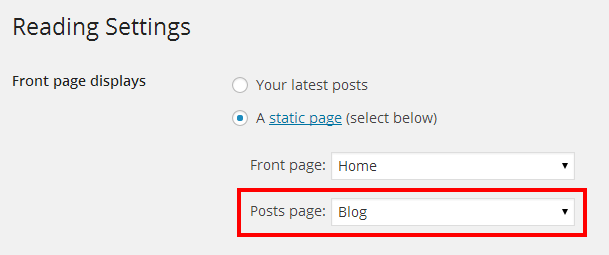
Blog Theme Options
Lato includes powerfull Theme Options panel organized into sections. There is a Blog Options that allows you to customize different aspects of the blog page: full width blog or blog with sidebar, 3 posts styles, share buttons, author info and related posts settings. You can also setup page header settings for category/tag archive page.
Here is a screenshot that shows the blog options described above
Creating Blog Posts
Follow These Steps To Create A New Post
- Step 1 - Navigate to Posts and click Add New
- Step 2 - Enter a title for your post
- Step 3 - Add content to your post using standard visual editor or click Backend Editor and use Visual Composer Page Builder. This allows you to build post using the Shortcodes. Take a look at the Shortcode section for how to use them
- Step 4 - Add Categories from the right side. To assign it to the post, check the box next to the Category name
- Step 5 - Add Tags from the right side. Type the name of the tag in the field, separate multiple tags with commas
- Step 6 - Click Set featured image on the right side and select image you want to use in post
- Step 7 - Select one of 8 post formats on the right side. When you click Gallery, Video, Audio, Quote or Link post format you will see an additional options below the content editor. See more details in Using Post Format section below
- Step 7 - Once it's all done hit "Publish" button
Here is a screenshot that shows the various post settings described above

Using Post Formats
Lato offers 8 post formats: Standard, Aside, Image, Gallery, Video, Audio, Quote and Link Post Format. When you select some of them you will see various options
Here is the list of post formats with description of each one
- Standard - this is the default post format without any additional options
- Aside - this is post format where only post content will be visible, your title and featured image will not
- Image - this is post format where only featured image will be visible on blog page. Your post content will be visible on single page, your title will not
- Gallery - this is post format where you can select slider or one of grid gallery type. After selecting gallery type Hit "Add Media" button and add images to the default WordPress Gallery. Finally select number of columns if you choose one of the grid gallery type. Your slider/gallery will be visible instead of the featured image. Your title and content will be visible like in standard post
- Video - this is post format where you can paste the URL to video on Vimeo, YouTube or one of these services or paste the URL to your local mp4 and webm file (optionaly paste image/poster for local video). Your video will be visible instead of the featured image. Your title and content will be visible like in standard post
- Audio - this is post format where you can paste the URL to your local mp3 and ogg file. Your featured image will be visible above the audio player. Your title and content will be visible like in standard post
- Quote - this is post format where only quote options like: quote, author and link will be visible. Your title, content and featured image will not
- Link - this is post format where only post content will be visible, your title and featured image will not
Here is a screenshots that shows the posts format options described above
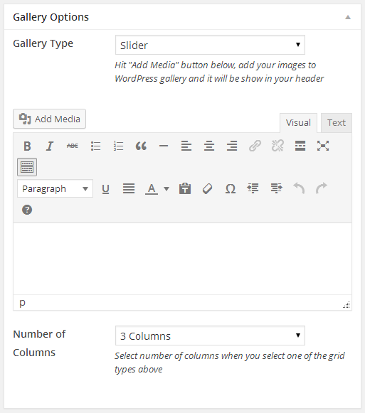 Gallery Post Options
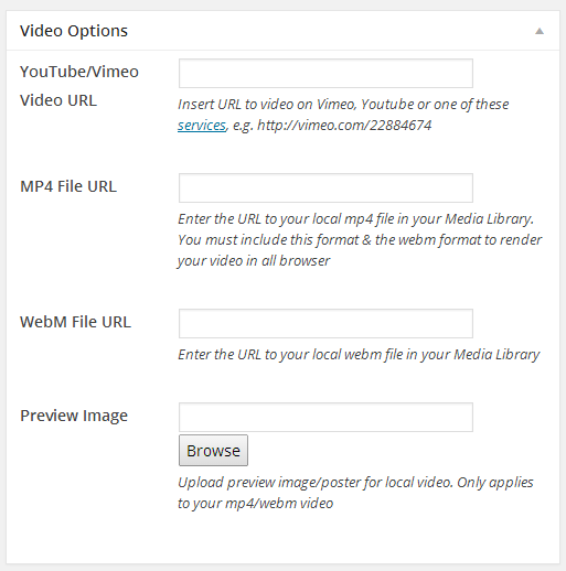 Video Post Options
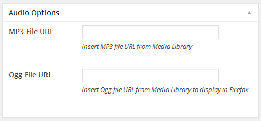 Audio Post Options
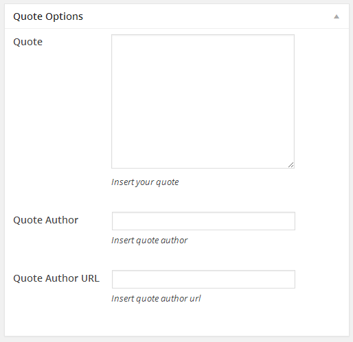 Quote Post Options
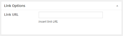 Link Post Options
Portfolio
With Lato you can add projects and create multiple portfolio pages. There are many portfolio page templates, special portfolio page options and Portfolio Theme Options. The following sections will covers each of these aspects of the portfolio that are listed below
- Setting Up Portfolio Page
- Portfolio Page Options
- Add Project To Portfolio
- Portfolio Theme Options
Setting Up Portfolio Page
Follow These Steps To Create A New Portfolio Page
- Step 1 - Navigate to Pages and click Add New
- Step 2 - Enter a new name for your page
- Step 3 - Find the Page Attributes box on the right side and select Parent page (it's usually set to no parent) if you want
- Step 4 - Select one of the portfolio page Template located in the same Page Attributes box (Portfolio: 2 Column with Sidebar, Portfolio: 3 Column, Portfolio: 3 Column with Sidebar, Portfolio: 4 Column, Portfolio: Full Width)
- Step 5 - Select any number of page options located below, like Header Options, Revolution Slider Options, and Portfolio Options
- Step 6 - Add content to your page using the Visual or Text editor. The pages is built using the Shortcodes. Take a look at the Shortcode section for how to use them.
- Step 7 - Once it's all done hit "Publish" button
Portfolio Page Options
When you create portfolio page you can choose from different page templates. Select one of the Portfolio Columns template if you want your projects wrapped in container or choose Portfolio Full Width to display projects in full width layout. Each of these groups has different Portfolio Options listed below.
- Portfolio Categories - You can select one or many categories and display projects that belongs to selected categories. Please note: When you create new project make sure to assign categories. Only the categories you have made will show up on this list
- Show Filter Options - Select if you want to display animated Filter Options on portfolio page. Please note that Filter Options will show up when you select at least 2 categories or "All" category above
- Enable Masonry Layout - You can show up your projects in same size with grid layout or display projects in different sizes with masonry layout. This options will be visible only when Portfolio Full Width is selected
- Portfolio Item Type/Full Width Portfolio Item Type - Select the following project style you want to display in: standard projects with portfolio title and categories below the thumbnail, multi-color projects with title and categories showed on hover or subtle style with zoom effect where title and categories are visible
- Meta Type Displayed Below Title - Select if you want to show categories or date with your project
- Show Image Lightbox On Click - Select if you want to show images in lightbox and not display link to your project. It is recommended for photography website
- Show Gutter - Select if you want to show up your projects side by side or separated by a transparent border
- Enable Pagination - Select if you want to show up the project page navigation
- Portfolio Items per Page - You can enter how many project want to display per page
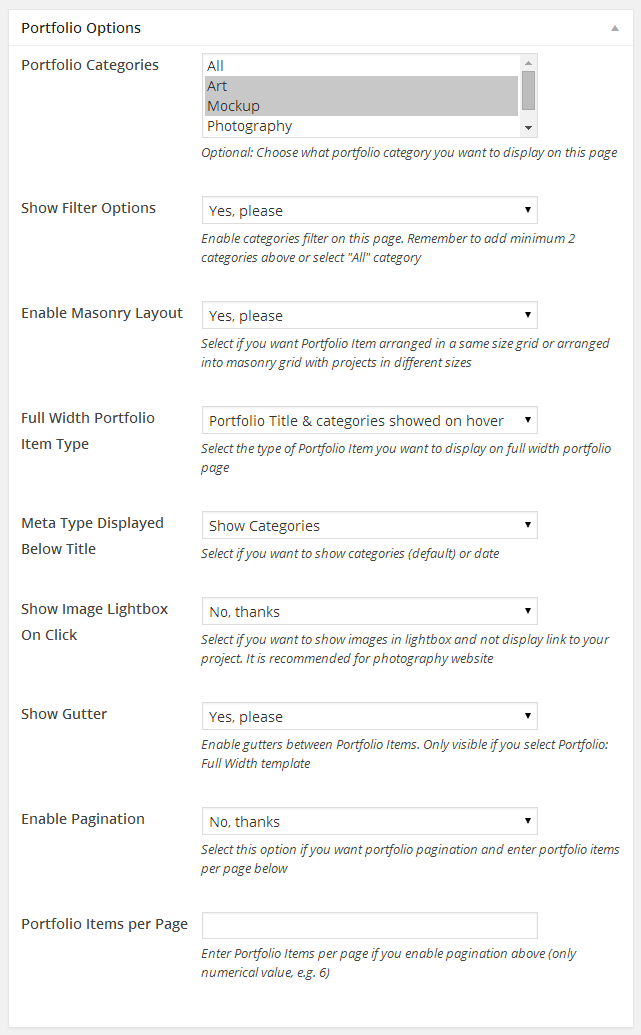
Add Project To Portfolio
You need to create project so they will show up on portfolio page. Lato offers several options for projects like categories, skills and much more. Categories are the filters you see above the projects that allows the user to sort the projects. Skills add additional meta info to projects. See below for information on how to create projects.
Follow These Steps To Create A New Project
- Step 1 - Navigate to Portfolio and click Add New
- Step 2 - Enter a new name for your project
- Step 3 - Add content to your page using the Visual Composer Page Builder. The pages is built using the Shortcodes. Take a look at the Shortcode section for how to use them
- Step 4 - Add Categories from the right side. To assign it to the project, check the box next to the Category name. These Categories are the filters that will sit above your project images and allow you to filter the different types of projects
- Step 5 - Add Skills from the right side. Type the name of the skill in the field, separate multiple skills with commas
- Step 6 - Click Set featured image on the right side and select image you want to use in project listing
- Step 7 - Select any number of header options, like title, background color or image background, parallax effect and text color
- Step 8 - Select standard or full width project type from Project Options section. Your detail project page will be shown in container with sidebar or as full width page
- Step 9 - Enter any number of project options, like description, client name, project URL and select if you want to show up the related projects at the bottom of the page
- Step 10 - You can choose the overlay background color visible on hover when you select this style on portfolio page
- Step 11 - You can add custom thumbnail image if you want to use this project in Portfolio Full Width page with masonry layout. If you leave this empty the featured image will be cropped automatically. After adding the image select size of image you have uploaded
- Step 12 - For a slider/gallery project, select Enable Slider/Gallery options and choose slider or one of grid gallery type. Hit "Add Media" button and add images to the default WordPress Gallery. Finally select number of columns if you choose one of the grid gallery type
- Step 13 - For a video project you can paste the URL to video on Vimeo, YouTube or one of these services or paste the URL to your local mp4 and webm file (optionaly paste image/poster for local video)
- Step 14 - For a Revolution slider project you need to add slider in Revolution Slider section and select your slider from the list
- Step 15 - Once it's all done hit "Publish" button
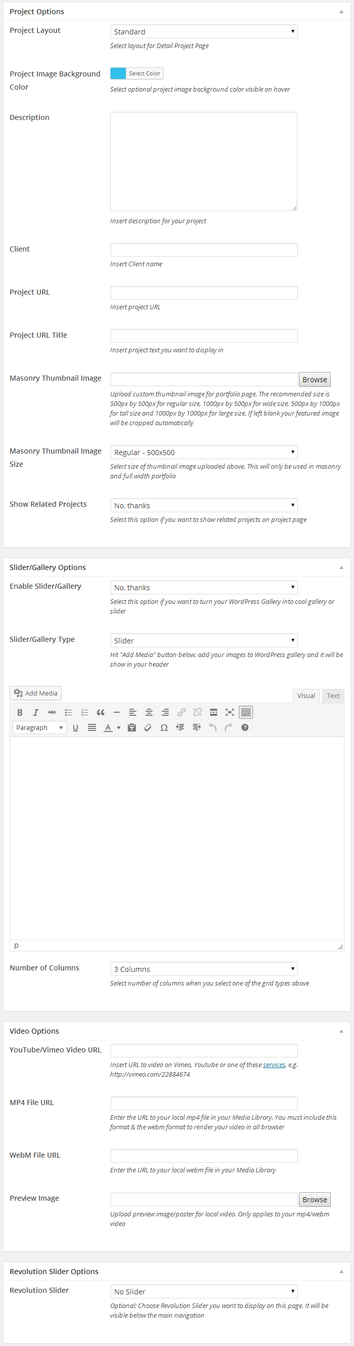
Portfolio Theme Options
Lato includes powerfull Theme Options panel organized into sections. There is a Portfolio Options that allows you to customize different aspects of the portfolio project page: portfolio slug, main portfolio page URL, share buttons and section titles. You can also setup page header settings for category/skill archive page.
Here is a screenshot that shows the portfolio options described above
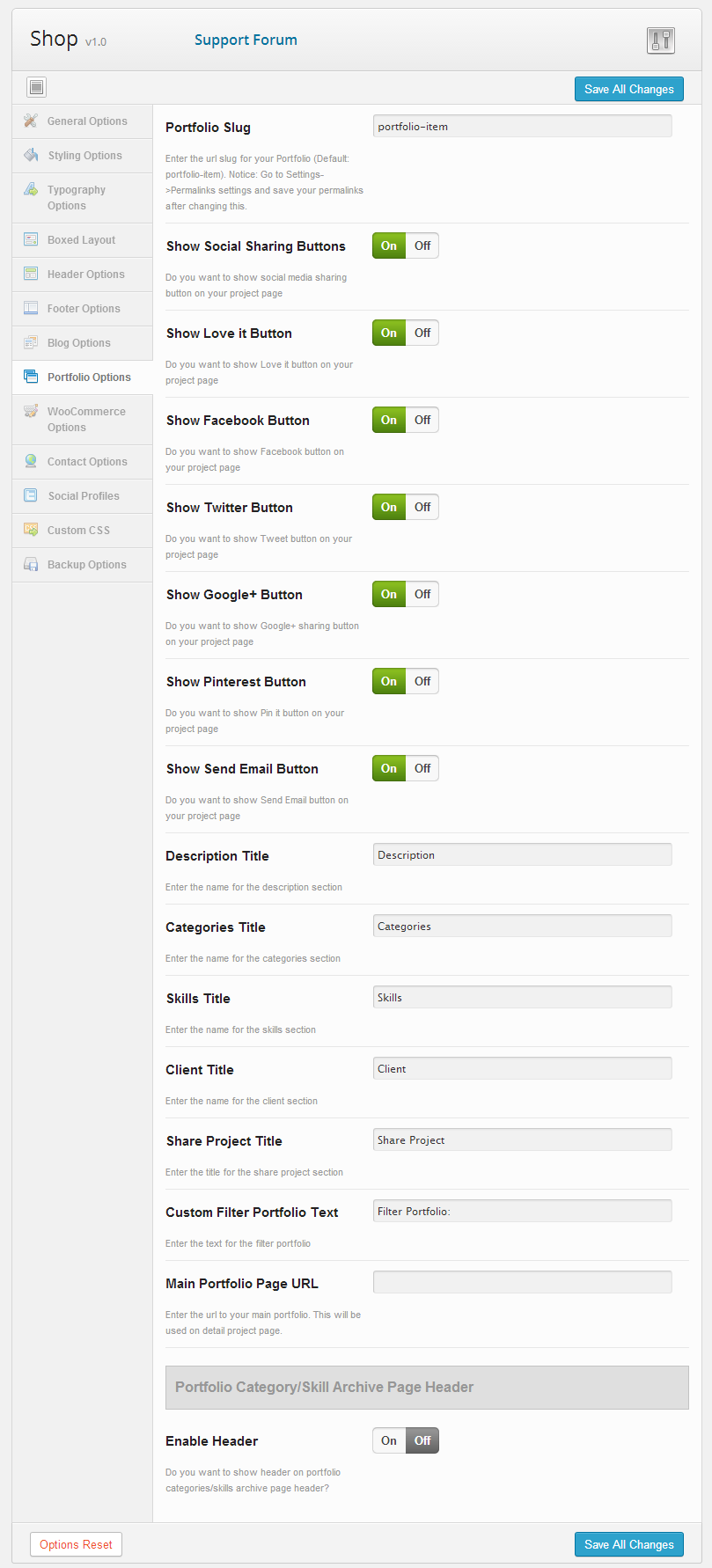
Sliders
Lato includes 2 sliders: premium Revolution Slider and Gravity Slider. Each slider can be used on any page in the header (just below the navigation and optional header) or you can use shortcode with visual builder and add your slider wherever you want on the page. The following sections will covers each of these aspects of the sliders that are listed below
- Gravity Slider
- Revolution Slider
- Add Slider To Page
Gravity Slider
The Gravity Slider is powered by the FlexSlider 2. You can easily add new slides and group them with special Admin Panel: Slides. This is the perfect slider to use if you just want single images or videos with animated headings and buttons.
Follow These Steps To Create New Gravity Slider
- Step 1 - Navigate to Slides > Add New Slide section
- Step 2 - Enter a new title for your slide. This will be only visible on Slides administration page
- Step 3 - Add Slide Groups from the right side. To assign it to the slide, check the box next to the Slide Group name. Slides from one group will be diplay in one slider. You can add one slide to many groups
- Step 4 - Add featured image from the right side. This will be only visible on Slides administration page
- Step 5 - If you want image slide click Browse and add image. Then select image alignment from the list
- Step 6 - If you want video slide enter URL to mp4 and webm files to render your video in all browser. Optionally you can add add image/poster
- Step 7 - Optionally you can also add slight texture overlay over your image or video
- Step 8 - Select text color and align and enter your main heading and caption
- Step 9 - Select if you want full width link, no link or show buttons
- Step 10 - If you select to show buttons above you can add 1 or 2 buttons. Enter title, link and select size and color from the lists
- Step 11 - Select how to align your headings and buttons
- Step 12 - Once it's all done hit "Publish" button
- Step 13 - You can sort your slides in any order. Navigate to Slides > Order Slides section
- Step 14 - Select Slide Groups from the list and drag and drop slides as you want
Here is a screenshot that shows the new slide options described above
Revolution Slider
Lato includes the popular Revolution Slider created by ThemePunch. This slider is fully animated slider that is 100% responsive and has amazing options. We can't cover everything here but we outline how to setup a slider and how to add slides to it. If you want to learn more please see original documentation created by ThemePunch which you can find in package.
Follow These Steps To Create New Revolution Slider
- Step 1 - Navigate to Revolution Slider section and click Create New Slider button
- Step 2 - Enter a slider name and alias
- Step 3 - Select the Source Type
- Step 4 - Then select the Slider Layout Type. Set the Grid and Responsive settings also.
- Step 5 - Once all it's done click Create Slider button
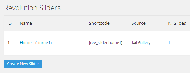
Follow These Steps To Add New Slides
- Step 1 - Click the Edit Slides button in Revolution Slider panel
- Step 2 - Click the New Slide or New Transparent Slide button
- Step 3 - You will see a new window where you can add image or images to create your slide
- Step 4 - Click the Edit Slide button to open the Slide Editing section. This is where you add all your slide content. You can customize different animation and other settings.
- Step 5 - To add a text layer, click Add Layer button that sits below the slider preview window. Enter your text in the Text/Html field and set position in Align, Position & Styling section. To style it, select one of the styles from the dropdown list or make your own by clicking Edit Style button
- Step 6 - Below the Layer General Parameters sections are Layer Animation and Layer Links & Advanced Params. Change the settings you wish and click Preview Slide button to see a preview of what will happen. There is also the Layers Timing & Sorting section where you set the time it takes for layer to show on the screen
- Step 7 - When all it's done click Update Slide button to save it and repeat process for more slides
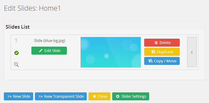
Here is a screenshot that shows the various Revolution Slider settings described above

Add Slider To Page
Once you have created your sliders, you need to assign them to a page or use a shortcode with visual builder. There are two methods to assigning a slider to a page. First you can assign a slider via Gravity Slider or Revolution Slider Options. Doing it this way always put the slider under the navigation and optional header. The second method is to insert shortcode with visual page builder.
Follow These Steps To Assign New Slider via Page Options
- Step 1 - Create or Edit any page
- Step 2 - Find the Gravity Slider and Revolution Slider Options
- Step 3 - Select the Slider from the dropdown list
- Step 4 - Enter the slider height
- Step 5 - Select the other settings like arrows, bullets and animation
- Step 6 - Once all it's done click Publish button
Follow These Steps To Assign New Slider via Shortcode
- Step 1 - Create or Edit any page
- Step 2 - Click the Backend Editor to see Visual Composer Editor
- Step 3 - Click Add Element and find Gravity Slider or Revolution Slider shortcodes
- Step 4 - Click one of the slider shortcode and select the settings in new window
- Step 5 - Once all it's done click Save button
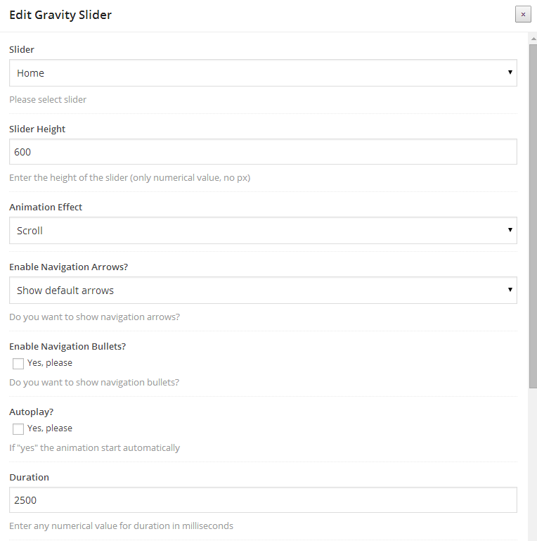
Footer
The Lato footer consists of the widget area and copyright area. You can set type of footer and change number of columns in Footer Options. Footer widgets can be added in widget section of WordPress. This section is going to cover two main areas that are listed below
- Adding Footer Widgets
- Footer Theme Options
Adding Footer Widgets
The top of the footer is a widgetized section that can display widgets in 3 or 4 columns. Widgets can be added, removed and rearranged in the WordPress Administration Appearance > Widgets section
Follow These Steps To Add Widgets To The Footer
- Step 1 - Make sure you select Extended Footer Type in Appearance > Theme Options > Footer Options. See the section below
- Step 2 - Navigate to Appearance > Widgets
- Step 3 - You will see 4 widget sections on the right hand side: Footer 1-4. Your widgets are located on the left
- Step 4 - Simply drag and drop the widgets you want from the left side into Footer bar widget areas on the right. See the image below
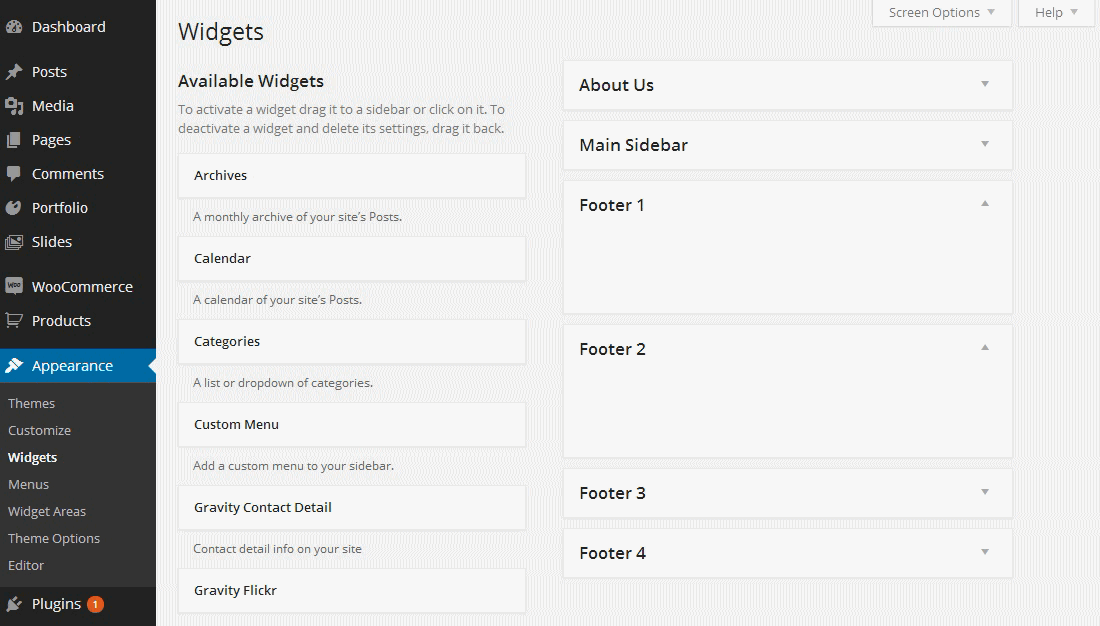
Footer Theme Options
There is a Footer Options in Appearance > Theme Options that allows you to customize the footer. See the screenshot below
Follow These Steps To Setup The Footer
- Step 1 - Navigate to Appearance > Theme Options > Footer Options section
- Step 2 - Check Enable Extended Layout checkbox field to show widgetized columns in footer
- Step 3 - Select number of widgetized columns (3 or 4) to show
- Step 4 - Select element on the left side of the bottom footer bar. You can choose: Copyright Text, Footer Menu or Social Icons
- Step 5 - Select element on the right side of the bottom footer bar. You can choose: Copyright Text, Footer Menu or Social Icons
- Step 6 - If you check Copyright Text in footer bottom bar enter copyright text in Copyright Text field
- Step 7 - Once it's all done hit "Save All Changes" button
Here is a screenshot that shows the footer options described above
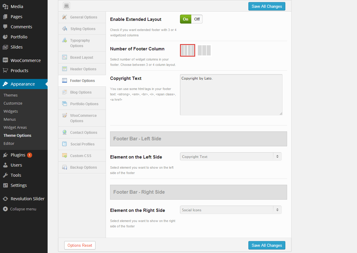
Widgets
Lato comes with default widgets and 4 custom widgets: Gravity Contact Detail Widget, Gravity Recent Posts Widget, Gravity Recent Projects Widget, Gravity Flickr Widget. All widgets are accessed in Appearance > Widgets. You can use multiple widgets per column and put as many widgets as you want. These are various fields and settings you can choose for each individual widget and all are self explanatory. Once you have finished adding the widgets, always make sure to hit the Save button to save the settings
Follow These Steps To Setup The Flickr Widget
- Step 1 - Navigate to Appearance > Widgets in your admin section
- Step 2 - Find the Gravity Flickr Widget and drag it to the sidebar or footer widget area
- Step 3 - Add your title and number of photos you want to get
- Step 4 - Click on "idGettr" link, http://idgettr.com
- Step 5 - Enter your username in place of username in the field and click "Find" and the ID will be generated
- Step 6 - Copy and paste the generated ID into "Flickr ID" field

Extras
This section is going to cover the various items such as our theme options, translation, custom fonts, sidebars and more. The sections are listed below.
- Theme Options Panel
- Custom Fonts
- Sidebar
- Translation
- CSS, Javascript & Credits
- Changelog
Theme Options Panel
Lato has an advanced Theme Options panel. All options are organized in tabbed sections. There are too many options to go over in these docs but please take some time and navigate through each tab to see what we offer. Go to Appearance > Theme Options in your WordPress admin to access the theme options panel. You can also backup your theme options by clicking on the Backup Options tab. See below for screenshots of our theme options panel.
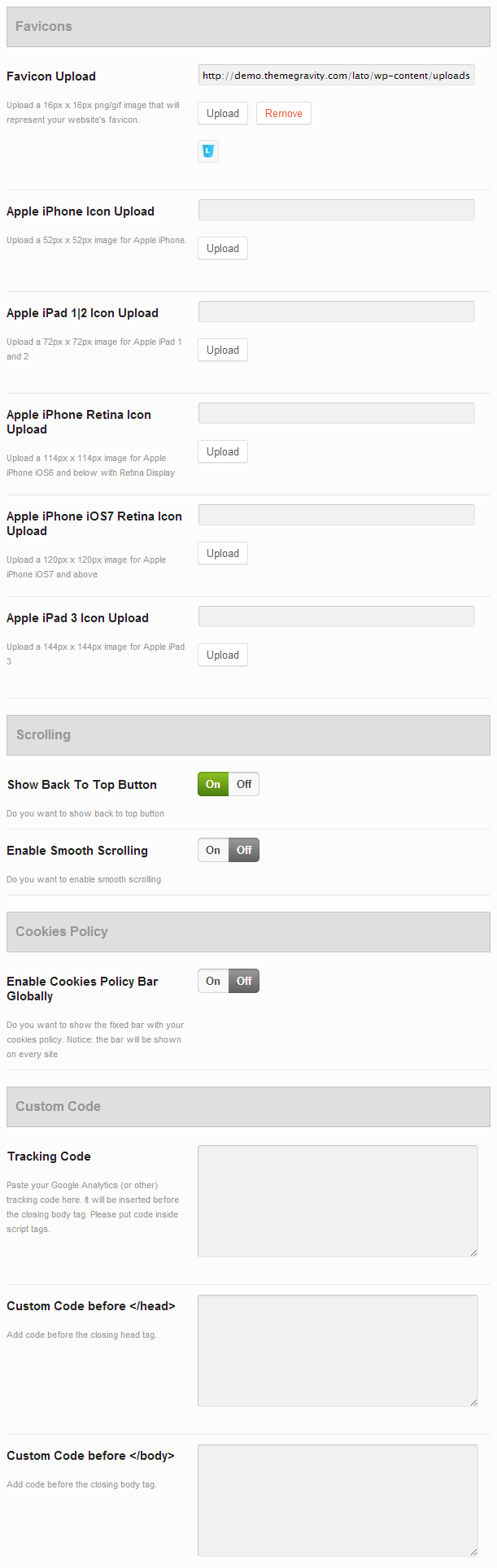 General Options
 Styling Options
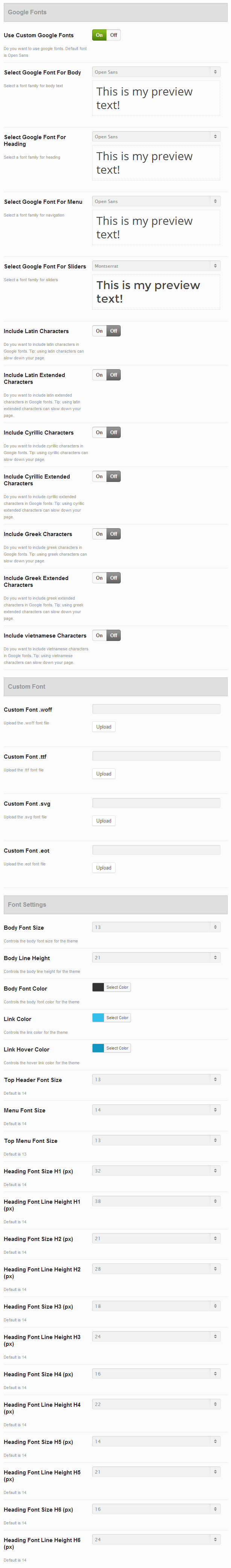 Typography Options
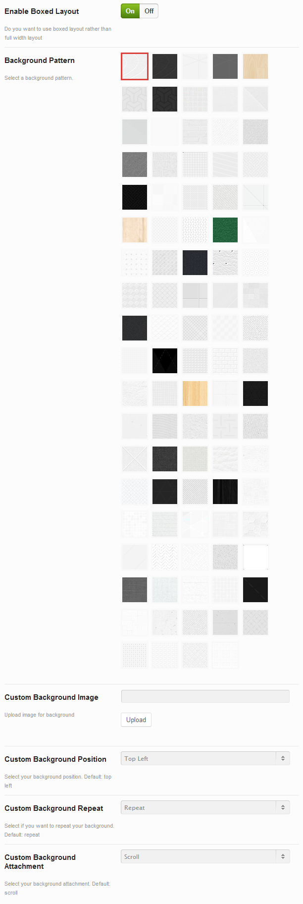 Boxed Layout
 Header Options
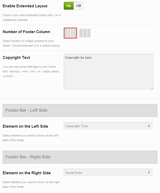 Footer Options
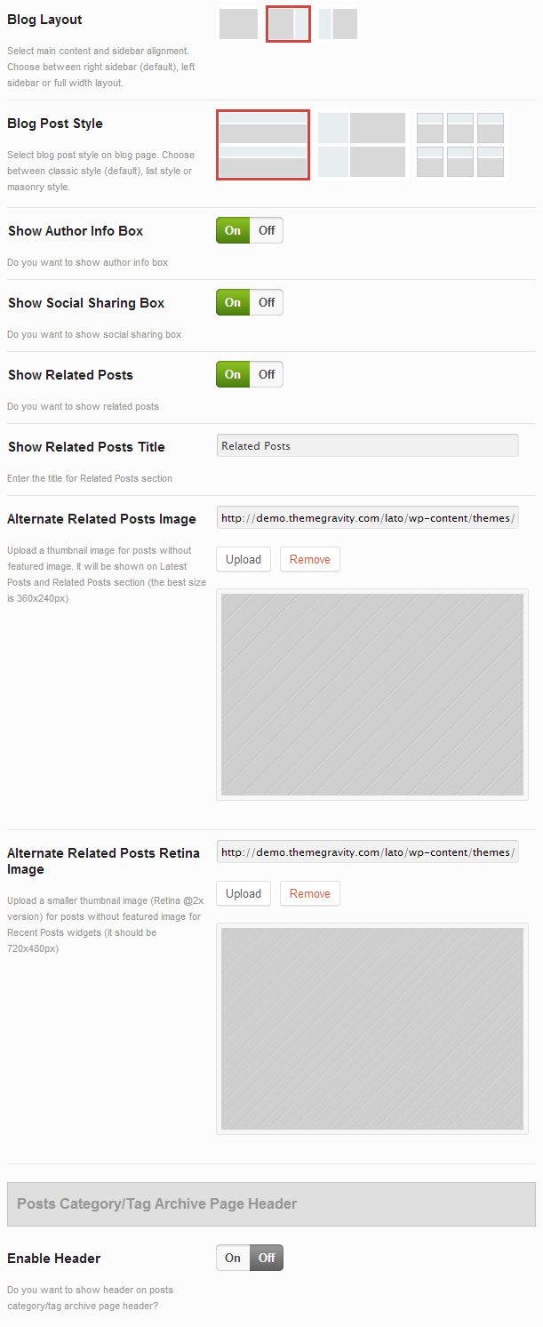 Blog Options
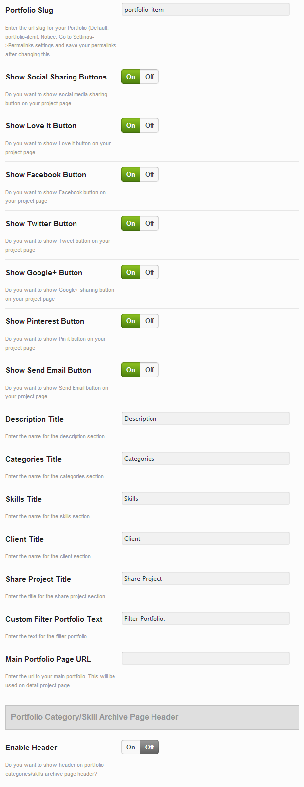 Portfolio Options
 WooCommerce Options
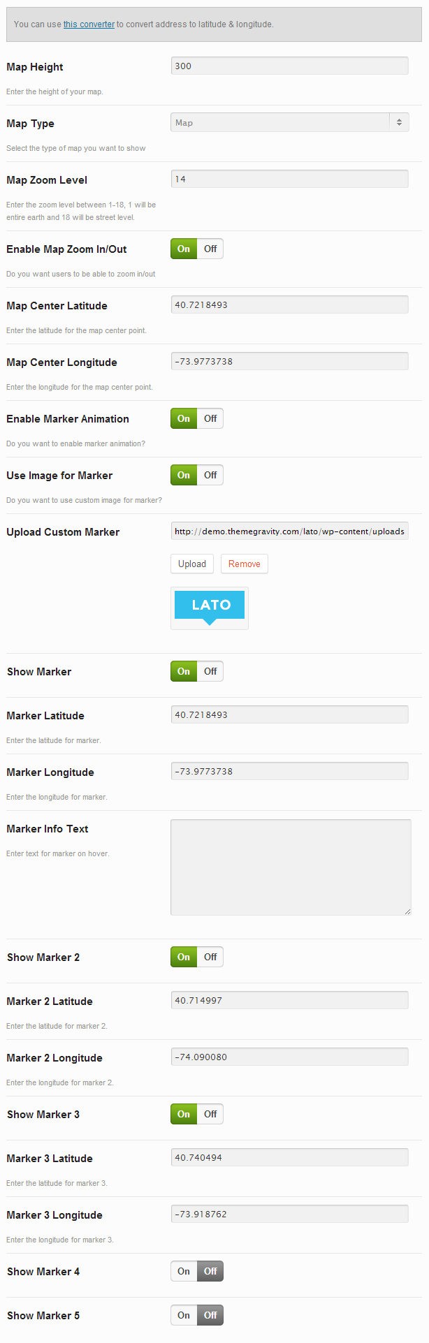 Contact Options
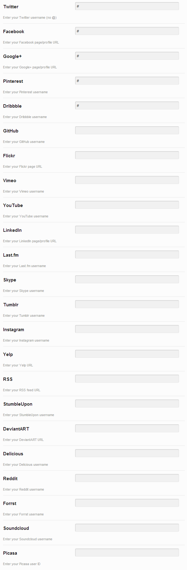 Social Profiles
 Custom CSS
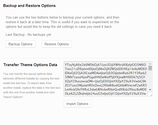 Backup Options
Styling Options
Here is the quick explanation of the most important styling options that Lato includes.
Accent Colors
These options allows you to set main colors on your site.
- Primary color - the color used as a main color for links, color for image overlay in galleries and products
- Primary color hover - the color used as a hover link color
- Accent color & 4 Extra Colors - the colors used in some shortcodes as an option
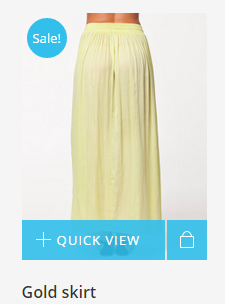 Primary Color 1
 Primary Color 2
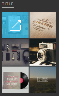 Primary Color 3
 Primary Color 4
 Primary Color 5
Main Header/Navigation
These options allows you to set colors in your main navigation including background, font color, caret, search button and shopping cart.
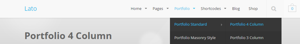 Main Navigation
Dropdown/Navigation
These options allows you to set colors of dropdown elements in header like main navigation background and color, shopping cart dropdown widget and mega menu.
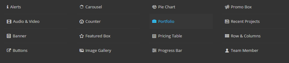 Dropdown 1
 Dropdown 2
Element Colors
These options allows you to set colors of couple of elements like accordions, alert messages, pricing tables, cookie bars and dividers.
Custom Fonts
With Lato you can choose from 600+ Google Fonts but you can also upload a Custom Font. Below you will find directions for how to use this option. You will need to have the 4 required font files. If you have one font format please use Font Squirrel Generator to generate required formats
Follow These Steps To Use A Custom Font
- Step 1 - Download your 4 custom font files: .woff, .eot, .svg, .ttf. All files are required
- Step 2 - Navigate to Appearance > Theme Options > Typography Options section
- Step 3 - Upload 4 required files into the corresponding field by clicking the "Upload" button and selecting each file
- Step 4 - After you uploaded the files, the custom font will be set for the headings and menu
- Step 5 - Make sure you click "Save All Changes" to save your settings
Sidebar
Lato allows you to add unlimited amount of custom sidebars thanks to the WooSidebars plugin. You can apply created sidebars to any page or template. Make sure you have the page template set to "Page: Left Sidebar", "Page: Right Sidebar", "Portfolio: 2 Column with Sidebar", "Portfolio: 3 Column with Sidebar" to show your sidebar
Follow These Steps To Create a Sidebar
- Step 1 - Navigate to Appearance > Widget Areas section
- Step 2 - Click "Add New", enter the title, select Pages in Conditions section and hit "Publish" button
- Step 3 - Once you are done, you need to add Widgets to the sidebar you just created
- Step 4 - Navigate to Appearance > Widgets and find your sidebar on the right side
- Step 5 - Simply drag and drop the widgets you want from the left side into your sidebar on the right
- Step 6 - Make sure you click "Save" to save your sidebar

Translation
Lato comes with translation file: en_EN.mo and en_EN.po that are located in the Languages folder inside your package. These files can be used to translate the theme into your language.
Follow These Steps To Translate The Theme Into Your Language
- Step 1 - Open the en_EN.po file in POEdit
- Step 2 - Use the translation field to make replacements
- Step 3 - Go to File → Save Us... and save file with your language name, for example: fr_FR.po for French translation. It will generate both a .po and .mo files
- Step 4 - Edit wp-config.php file located in the root folder of WordPress and define WPLANG prefix with your language name, for example: fr_FR for French translation
- Step 5 - Go to your server via FTP, navigate to the theme folder and find the "languages" folder located in wp-content > themes > Lato
- Step 6 - Upload the language files into the "Languages" folder
CSS, Javascript & Credits
CSS Files:
- style.css - Default CSS
- variants.css - Theme Variants
- ie8.css - CSS for IE8
Javascript Files:
- theme.js - Default CSS
- plugins.js - Plugins included: jQuery transit, Modernizr
Credits:
- jQuery
- jQuery UI Tabs
- jQuery UI Accordion
- Isotope Plugin (Commercial Licence - you don't need to purchase your own licence)
- FlexSlider
- Modernizr
- jPanelMenu
- jRespond
- jQuery Easing
- jQuery Cookie
- Superfish
- Waypoint
- IcoMoon, FontAwesome, Steadysets, Linecons & Meteocons Library
- Subtlepatterns.com patterns
- jQuery.appear
- easyPieChart
- Transit
- carouFredSel
- imagesLoaded
- magnificPopup
Changelog
Lato is constantly being updated with new features and adjustments. You can always view the most recent update information on the Mojo Marketplace item page, or view the full changelog in the changelog.txt file inside the package zip file. You can also view the full changelog below.
Lato changelog